What Is an Infographic? Definition, Examples, Types, and How to Make One
In this guide
- Quick answer: what is an infographic?
- What the word actually means
- What does an infographic look like?
- Why people use infographics, and what the research says
- Common types of infographics
- What are the 5 elements of an infographic?
- What makes a good infographic: the CLEAR check
- Where infographics go wrong
- How to create an infographic in seven steps
- Infographic templates: when should you use one?
- Where infographics get used
- Can an infographic be a video?
- Frequently asked questions
- The short version
You have seen hundreds of infographics. The poster in a clinic showing how to wash your hands. The chart in a news story. The work slide with one big number on it.
The word sounds like something only designers use. The idea is plain. An infographic is information shown visually.
Most people who look this term up start with the same sentence: “I’m not a designer.” You don’t need to be one to read this guide, or to make something useful by the end of it.
Quick answer: what is an infographic?
An infographic is a visual representation of information, data, or knowledge. It uses short text, icons, charts, illustrations, and layout to explain a topic fast.
Wikipedia defines infographics as “graphic visual representations of information, data, or knowledge intended to present information quickly and clearly” (Wikipedia). The University of Hull’s library guide puts it more simply: an infographic is a way of communicating information graphically (University of Hull).
Simplest definition: an infographic is information shown visually.
You would use one when you need to:
- Summarize a topic that takes too long to explain in writing
- Show what a set of numbers means
- Compare options side by side
- Walk someone through steps in order
- Make something easy to scan and share
What the word actually means
“Infographic” is a clipped compound of two words: information and graphics (Wikipedia). That is the whole etymology.
An infographic is not just any picture with words on it. The difference is function, not format. Alberto Cairo, Knight Chair in Visual Journalism at the University of Miami, calls infographics “graphic representations of information that are tightly edited and directed in some sense by the designer” (Peachpit).
The load-bearing word is directed. Someone has decided what the point is and built a path to it. The Hull guide says the same thing in design terms: an infographic needs “its own internal structure which gives it a clear read order.”
A photo is a graphic. A logo is a graphic. An infographic is a graphic with a job and a reading order.
It can take several shapes: a static image, a printed poster, a slide, a social post, an interactive page, or a short video (Adobe Express).
What does an infographic look like?
Three real examples show the range better than any definition can.
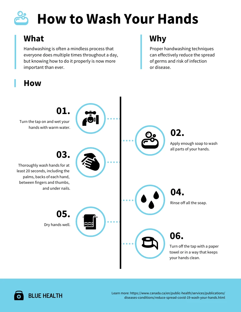
A process infographic. The CDC’s handwashing poster shows five steps: wet, soap, scrub for at least 20 seconds, rinse, dry (CDC). Each step gets a number, one icon, and a few words. As a paragraph, the same content would be slower to read and harder to follow with wet hands.
A statistical infographic. Florence Nightingale charted the number and causes of deaths in each month of the Crimean War in 1857, and used the drawing to persuade Queen Victoria to improve military hospitals (Wikipedia). One picture carried an argument a table of figures could not.
A timeline infographic. Charles Minard’s 1869 map of Napoleon’s march packed four changing variables into one image: direction, location, army size, and temperature. You watch an army shrink across a page.
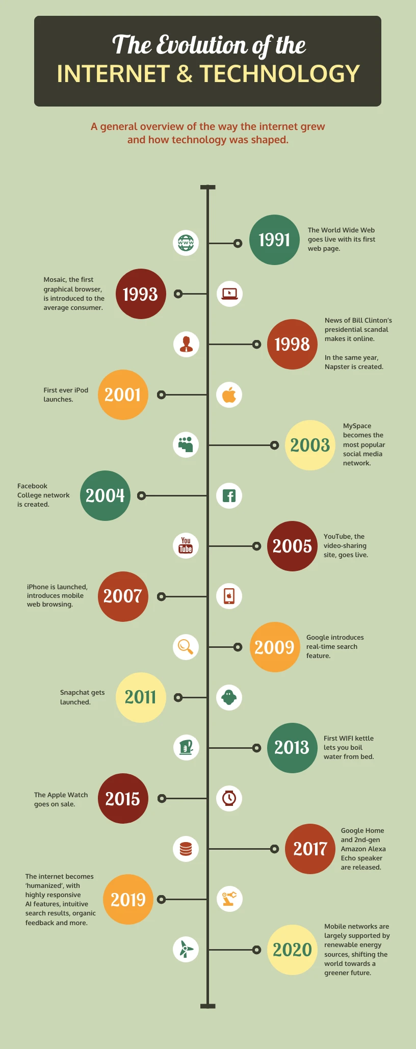
In all three, the visual does not decorate the information. It carries it.
Why people use infographics, and what the research says
Most guides open this section with numbers that fall apart when you check them. Here is the honest version.
Pictures plus words beat words alone, by a modest margin. A 2025 meta-analysis of Richard Mayer’s multimedia learning research, covering 92 articles and 181 studies, found an overall effect of g = 0.37, with text combined with diagrams producing the largest and most consistent gains (Cromley & Chen, Educational Research Review).
An infographic does not automatically beat well-written text. Three randomized trials compared an infographic with a plain-language summary of the same medical review, testing students, consumers, and doctors. Knowledge scores showed no difference in any trial, though infographic readers rated the reading experience higher (Buljan et al., Journal of Clinical Epidemiology, 2018).
People skim. In an average visit, readers have time for at most 28% of the words on a page, and 20% is more likely (Nielsen Norman Group).
Numbers are hard for many readers. In the 2023 US skills survey, 34% of adults aged 16 to 65 scored at or below Level 1 in numeracy (NCES). If your message rests on a statistic, showing it is not dumbing it down.
Three popular claims you should not repeat
| The claim | What we found |
|---|---|
| “The brain processes images 60,000 times faster than text” | No study says this. Researchers have chased the source for over a decade and found only promotional material with no citation behind it (cogdogblog; PolicyViz). The real published number: people can pull meaning out of a picture shown for as little as 13 milliseconds (Potter et al., 2013). |
| “65% of people are visual learners” | Traced to a 2004 law-teaching essay that cites no study. Learning styles have no good evidence behind them, though a review covering 15,405 educators found 89.1% still believe in them (Newton & Salvi, 2020). |
| “People remember 65% of what they see three days later” | No primary source exists for this figure or the retention pyramid behind it. |
Leave all three out of your own work. Your credibility is worth more than a round number.
Common types of infographics
The type you pick depends on the shape of your information, not on which template looks nicest.
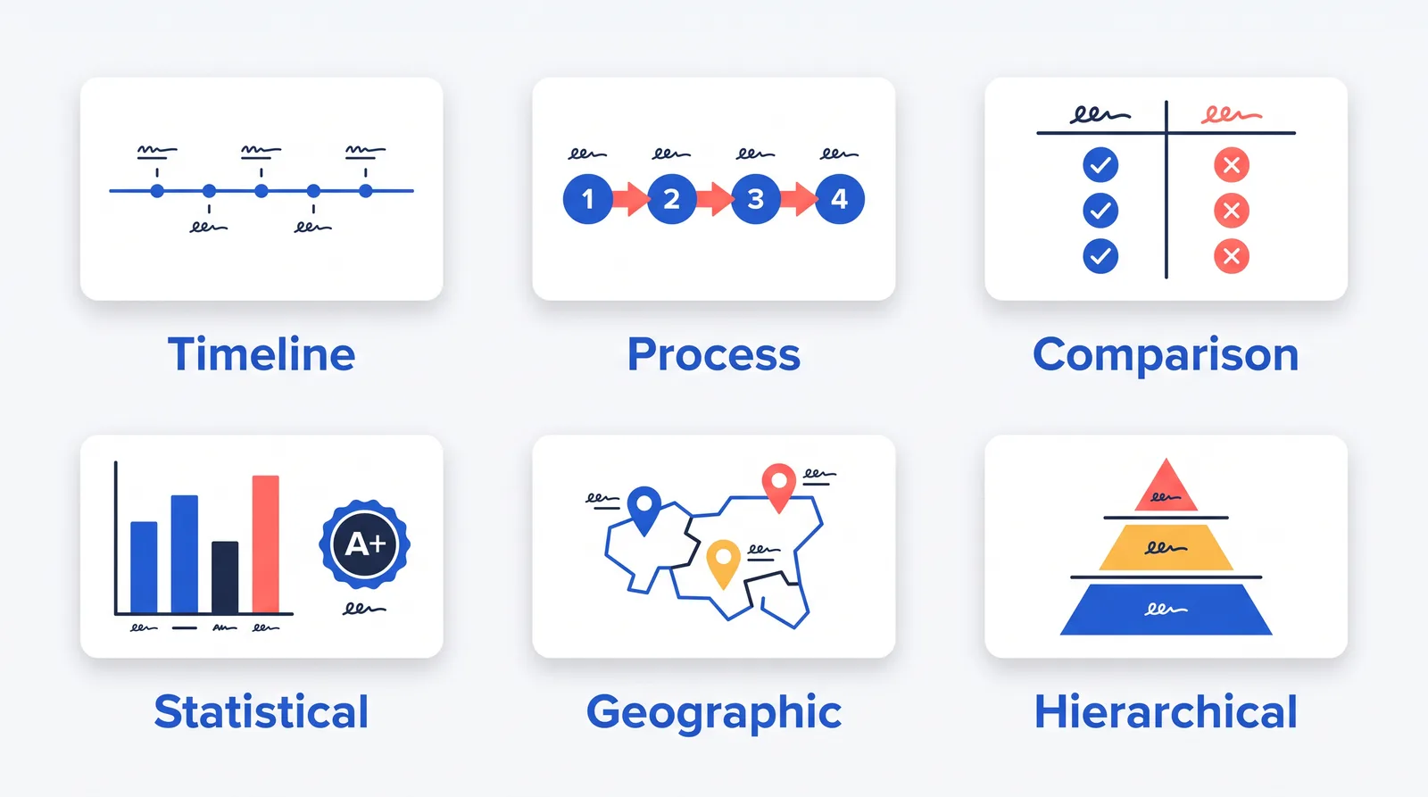
| Type | Best for | Example topic |
|---|---|---|
| Informational | Explaining or summarizing a topic | “What is renewable energy?” |
| Statistical | Showing numbers or research | Survey results, report data |
| Timeline | Events over time | Company history, project roadmap |
| Process | Steps in order | How to plan a campaign |
| Comparison | Weighing options on the same criteria | Product A vs. Product B |
| List | Tips, resources, checklists | 10 design tips |
| Geographic | Location-based data | Regional sales by state |
| Hierarchical | Ranks, levels, structures | An org chart, Maslow’s hierarchy |
There is no official list. Venngage names nine types, Adobe Express six, and Marq nine, and the three do not match (Venngage, Adobe Express, Marq).
To choose, ask these in order and stop at the first yes.
- Tied to dates or past events? Timeline.
- Steps to carry out in order? Process.
- Options weighed on the same criteria? Comparison.
- The point is a set of numbers? Statistical.
- Values that only make sense attached to places? Geographic.
- Levels, ranks, or what contains what? Hierarchical.
- Items unordered and roughly equal? List.
- None of the above? Informational.
Hybrids are normal. Pick the type that matches your main purpose and let the rest support it. If two answers feel equally true, the graphic is doing two jobs and should be two graphics.
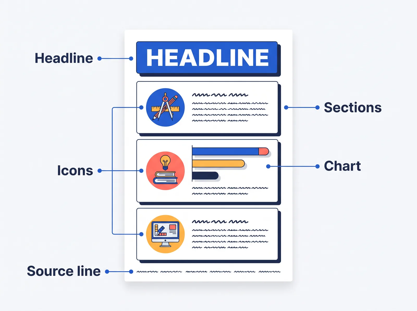
What are the 5 elements of an infographic?
There is no agreed list of five. Venngage names visual hierarchy, data and facts, graphics and icons, color and typography, and concise messaging. Adobe Express does not enumerate five at all. We say so up front because a made-up canon is worse than an honest one.
Here are the five we use.
1. A headline that states the takeaway. Not the topic. “Most canteen waste is food students threw away themselves” beats “Canteen waste 2026.” It should be the largest text on the graphic.
2. Concise information. Short labels, one point per section, no paragraphs.
3. Visuals that do work. Charts, icons, maps, and diagrams that carry meaning. Every icon needs a text label. If you cannot say what a decorative element does, delete it.
4. An organized layout. Hierarchy, spacing, grouping, and a clear path through. Cairo’s line is worth remembering: “A visualization is not something to be seen, but something to be read” (Cool Infographics).
5. Accurate data and visible sources. A named publisher and a year for every number. Statistics Canada states the rule flatly: “A chart should always include the sources of the data used” (Statistics Canada).
Color, type, white space, and a call to action matter too. They support those five rather than replacing them.
What makes a good infographic: the CLEAR check
CLEAR is our own framework, not an industry standard. We built it by tying the mistakes beginners make most often to a published standard wherever one exists. It takes about five minutes to run against a draft.
| Letter | What it means | The quick test |
|---|---|---|
| Concise | Every element earns its place | Read the graphic aloud. Over 60 seconds, cut a section. |
| Logical | One obvious path from start to finish | Ask someone to trace the reading order with a finger. Hesitation means the hierarchy is broken. |
| Evidence-based | Every number traces to a named source and date | Can you name the publisher and year in 10 seconds? “I got it from another infographic” is not a source. |
| Accessible | Anyone can get the information, including people who cannot see the image or tell certain colors apart | Run the four checks below. |
| Relevant | It answers a question a specific reader has | Name one real person who should read this. Would they already know each section, or not care? |
The accessibility check, with the actual numbers
These come from the Web Content Accessibility Guidelines, the standard the W3C publishes.
- Contrast. Body text needs a contrast ratio of at least 4.5:1 against its background. Large text, meaning 18pt and up, or 14pt and up if bold, can drop to 3:1 (SC 1.4.3).
- Chart parts and icons. Bar fills, line strokes, and meaningful icon shapes need at least 3:1 against what sits next to them (SC 1.4.11).
- Never color alone. Color must not be the only thing separating two categories (SC 1.4.1). Color blindness affects around 8% of men and 0.5% of women, so a red-versus-green legend is the most common own goal there is (UK Government Analysis Function).
- Alt text, in two parts. An infographic counts as a complex image. W3C asks for a short description that identifies it, plus a long description giving “a textual representation of the essential information conveyed by the image” (W3C WAI). In practice: a short alt attribute, plus the full content written out as real text on the page.
How many sections should it have?
Our rule: three to five, and never more than seven. There is no official limit, but research on short-term memory puts the number of chunks most people hold at once at around four, plus or minus one (Cowan, 2001). That finding is about memory tasks, not design, so treat it as the reasoning behind our rule rather than proof of it. At six or seven sections, group them into clusters. At eight, you have two infographics.
Being concise is not the same as being thin. Cairo argues that infographics “shouldn’t simplify, but clarify,” and clarifying sometimes means adding information, because context is what makes a number mean anything.
Where infographics go wrong
Most weak infographics fail in the same five ways.
| Problem | What you can see | The fix |
|---|---|---|
| Text overload | More than two lines of body text per section | Cut each section to a label plus one line. Move the detail into the page around the image. |
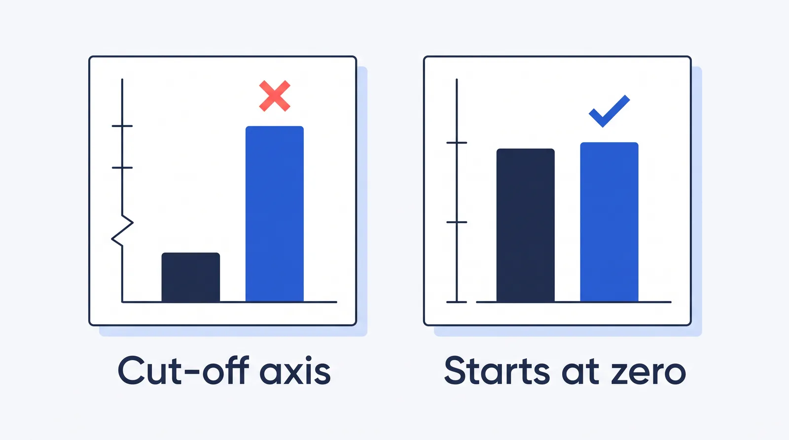
| Misleading charts | A bar chart whose axis does not start at zero, 3D bars, a pie with seven slices, two charts on different scales | Zero-baseline every bar chart and drop 3D. Cut-off axes shifted readers’ sense of a difference by an average of 32 points on a 100-point scale in one study (Wijnker et al., 2022). |
| Weak hierarchy | Three type sizes competing to be biggest, no clear entry point | One headline, one hero element, one section style. Then run the finger test. |
| Poor contrast | Light grey on white, text over a photo, red versus green as the only difference | Hit the numbers above. Print a copy in black and white and see what survives. |
| Missing sources | A bold statistic with no attribution, or one traced only to another infographic | One source line on the graphic itself: publisher, title, year. The image travels without your page. |
Edward Tufte, who coined the term chartjunk, wrote that “cosmetic decoration, which frequently distorts the data, will never salvage an underlying lack of content.” Kate Moran of Nielsen Norman Group says it in beginner language: “Your point is interesting enough on its own. You don’t need gaudy stripes or 3D effects to dress it up” (NN/g).
One failure is baked into the format. Text inside an image is not real text. Google’s web.dev guidance is blunt: “Text in images is not selectable, searchable, or accessible” (web.dev). WCAG asks you to use real text rather than pictures of text wherever the technology allows (SC 1.4.5). The fix is not to give up on infographics. It is to publish the same content as text alongside the image, every time.
How to create an infographic in seven steps
Order matters more than tools. Across practitioner guides one pattern repeats: content first, format second, style last. Venngage’s own workflow puts styling at step five of five. Beginners usually start there.
1. Set the goal. Ask what someone should know or do after 30 seconds with your graphic, then write it as one sentence: “This infographic will show five ways students can cut food waste at school.” If you cannot write that sentence, you are not ready to design.
2. Name the audience. Pick one real person who would read this. Classmates need plain words and defined terms. Colleagues share your vocabulary. A busy manager reads the headline and one number. Students and general readers will mostly see it on a phone.
3. Gather only what you need. Collect the facts, steps, and figures that support the goal, and nothing else. Save the source URL for every number as you go.
4. Choose the type and outline it. Use the decision list above, then write the outline in plain text: title, sections, key numbers, visual ideas, sources, closing step. The outline is what stops clutter later.
5. Design the layout, then add visuals. Put the most important takeaway first. Group related ideas and leave real white space. For each section, ask whether it needs a chart, an icon, or nothing.
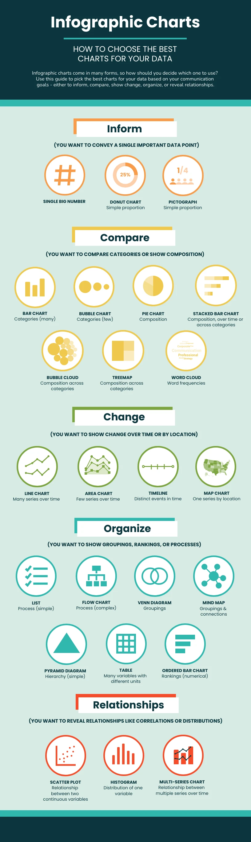
Chart choice is not a matter of taste. Cleveland and McGill’s classic experiments ranked how accurately people read visual encodings: position along a common scale is read most accurately, then length, then angle, then area, then volume (Journal of the American Statistical Association, 1984). That is why a bar beats a pie.
| Your data | Use | Avoid |
|---|---|---|
| A few categories, one value each | Sorted horizontal bar chart with labels | Pie charts, 3D bars |
| Parts of one whole, two or three parts | A single stacked bar, or a simple pie | Any pie with five or more slices (Datawrapper) |
| One measure over many time points | Line chart | A wall of thin bars |
| A proportion you want people to feel | Icon array, such as 10 figures with two filled | A donut with a percentage in the middle |
| Values attached to places | Choropleth map for rates, symbol map for counts | A map of raw counts, which just redraws population |
| Fewer than about four numbers | No chart. Set the numbers as large type | Building a three-bar chart |
Nigel Holmes, graphics director at TIME for 16 years, still says “the data must come first.” His color advice is the most useful instruction here: “Start with black and white, and only introduce color when it has relevant meaning” (Visualising Data).
6. Add your sources. One line at the foot: publisher, title, year, short link. With more than one source, number the statistics and list the sources in the same order. If you collected the data yourself, say so and give your method, sample, and dates. That is a strength, not an apology.
7. Review, export, and share. Run these checks before anything goes out.
- Show it to one person for 30 seconds, take it away, and ask what it said. If the answer is not your headline, the hierarchy failed.
- Recalculate every percentage yourself, and confirm every bar chart starts at zero.
- View the exported image at about 375 pixels wide, a common phone width, without zooming. Every word should be legible.
- Check contrast with a free tool such as the WebAIM Contrast Checker, then convert a copy to greyscale. If two categories become identical, add labels or patterns.
- Export as SVG for vector graphics, PNG for flat color and text, WebP for a good size-to-quality trade-off, or JPEG only for photo-heavy images (Google Search Central). For print, use A4 portrait at 300 dpi and check contrast again afterwards.
- Give the file a descriptive, hyphenated name, then write the short alt text and publish the long description as real text on the page.
Put your name or URL inside the image too. The moment someone saves your infographic, it stops being attached to your page.
Infographic templates: when should you use one?
A template gives you a working layout, a color pairing, section blocks, and chart placeholders, so you start from a design instead of a blank page. Teachers and librarians recommend templates for exactly this reason, then move students to an empty canvas for the second one.
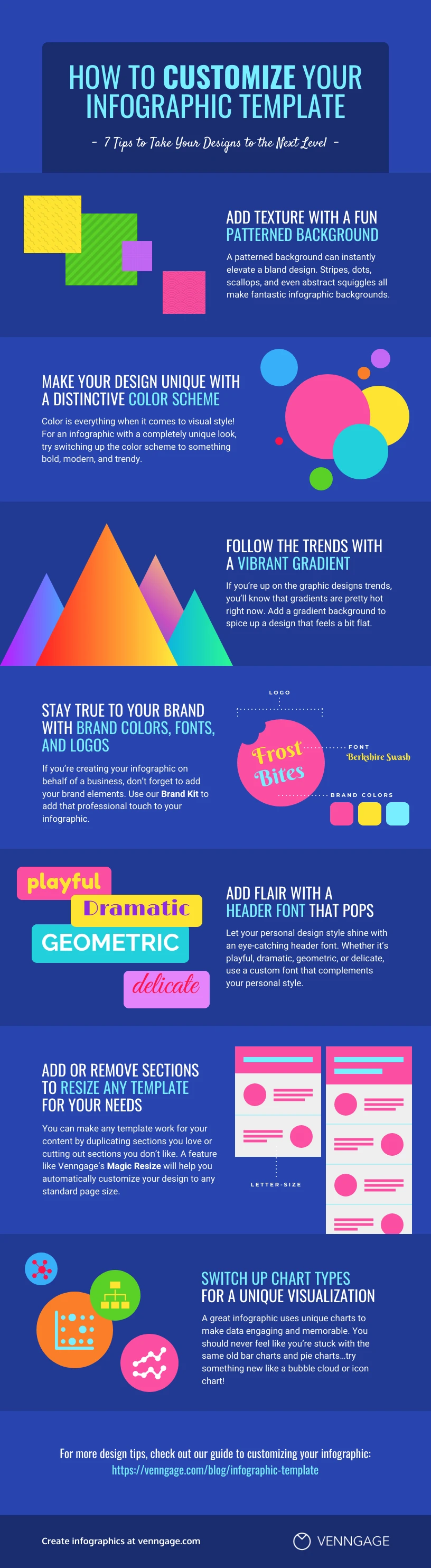
Two cautions. Nobody has published a measurement of how much time a template saves, so treat “make one in 20 minutes” claims as marketing. And template fatigue is real: audiences now recognize the popular layouts, and a finished piece can end up looking like countless others. Changing the fonts, colors, and icon style to suit your subject fixes most of that.
Start with a template that matches your goal, not the one that looks best, then personalize it.
Where infographics get used
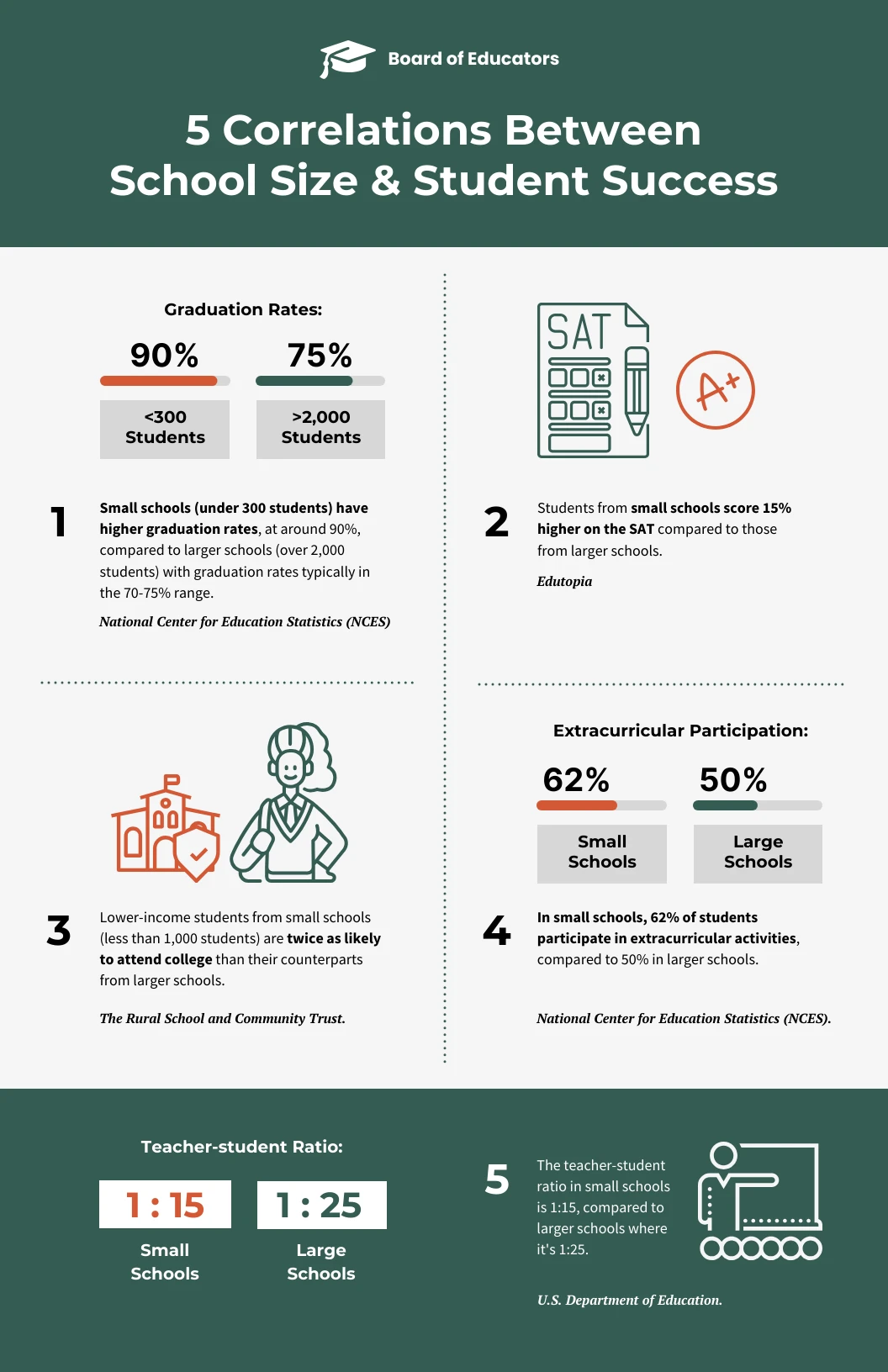
Students. Class projects, science posters, book summaries, and study guides. The stronger research finding is about making them, not reading them. A scoping review of infographics in higher education found the most effective practice combined ready-made infographics with students creating their own, building visual and information literacy alongside subject knowledge (Jaleniauskiene & Kasperiuniene, 2023). In one political science course, students summarized a research article as a graphic and reported gains in critical thinking and confidence, though those are self-reports, not measured grades (Kalaf-Hughes, 2023). For citations inside a graphic, use short notes near each fact and a “Sources” line at the bottom.
Presentations. A long vertical infographic does not survive on a slide. Split it: one idea per slide, large type, simple charts. Microsoft’s accessibility guidance says to use 18pt or larger with sans serif fonts, give every slide a unique title, and add alt text to every visual, charts included (Microsoft).
Business and marketing. Campaign results, product comparisons, customer journeys, and company timelines all fit. Keep claims inside what your data supports. The visual form makes a message feel more credible, which is why a stretched chart does real damage.
Social media. Design for the crop, so single sections can be lifted out and posted alone. LinkedIn recommends 1200 x 627 pixels for shared images, requires PNG or JPEG, and caps uploads at 3MB (LinkedIn). Pinterest recommends 1000 x 1500 pixels (Pinterest). Specs change often elsewhere, so export at least 1080 pixels wide in a square or portrait crop and paste the full text into the caption.
Can an infographic be a video?
Yes. An animated or video infographic uses motion graphics, icons, charts, text, and often narration to explain the same kind of information. Adobe treats static and short video as two formats of one thing, and design tools list animated infographics as a type rather than a separate medium.
Motion is a layer you add to a finished static design, not a skill you need first. Professional animated infographics get built in a design tool and animated afterwards.
Animation is not automatically better. In a study of 112 third-grade students, interactive infographics helped learning most, then animated, then fixed. For retention, there was no difference between the three (AlMashaleh, 2023). If you publish one, add captions or a text alternative, because a video needs more than alt text (SC 1.1.1).
Frequently asked questions
What is the simplest definition of an infographic? Information shown visually, using icons, charts, images, and short text.
What is an infographic and example? A visual explanation of information or data. The CDC’s handwashing poster is one: five numbered steps, one icon each, almost no text.
What are the 5 elements of an infographic? There is no official list. Ours: a headline that states the takeaway, concise information, visuals that do work, an organized layout, and accurate data with visible sources.
How do I create an infographic? Set a goal, name your audience, gather only what you need, choose a type and outline it, design the layout and visuals, add sources, then review and export.
What is the difference between a graphic and an infographic? A graphic is any visual. An infographic is built to communicate information, with a structure and a clear reading order.
Do infographics need data? No. Timelines, processes, comparisons, and lists work without a single number.
Are infographics good for students? Yes, with a caveat. The research is strongest when students make them rather than only read them.
How long should an infographic be? Three to five sections. If reading it aloud takes over a minute, cut something.
What is an infographic poster? A printed or large-format infographic. It is not the same as an academic poster, which carries far more detail for a specialist audience.
What tools can I use? Infographic makers such as Venngage, Adobe Express, Marq, Visme, and Canva all ship template libraries. Presentation and chart tools work too.
The short version
An infographic is a visual way to explain information clearly and quickly. It combines short text, visuals, layout, and sometimes data.
Pick the type that matches the shape of your information. Keep it to a handful of sections. Show where every number came from. Make it readable on a phone, and readable for people who cannot see it at all.
If this is your first one, write a single sentence describing what a reader should know after 30 seconds, choose a template that matches that goal, and let the design follow the message.
Sources checked September 2026. WCAG 2.2 has been the current W3C recommendation since 12 December 2024; WCAG 3.0 is still a working draft.