15 Infographic Color Schemes with HEX Codes
In this guide
- What Is the Best Color Scheme for an Infographic?
- Use These 15 Infographic Color Schemes
- Choose the Right Infographic Color Scheme
- Limit Your Infographic to 3–5 Colors
- Know the Basic Color Schemes for Infographics
- Make Infographic Colors Readable and Accessible
- Use Tools to Create and Test Infographic Color Schemes
- Match Infographic Color Schemes to Use Cases
- FAQ About Infographic Color Schemes
By [Author Name], [Design, UX, or data visualization credential] Published: [Date] | Last updated: [Date]
A good infographic color scheme helps people scan your information faster. Looking good is only half the job.
Color decides what readers notice first, sets the mood, and separates one group of data from another. It also decides whether people can read your text. In its 2026 study of the top one million home pages, WebAIM found low-contrast text on 83.9% of them.
Below, you’ll find 15 palettes with HEX codes, a job for each color, and contrast scores that show which pairs are safe for text. A HEX code is the six-character code, like #1F3A5F, that design tools use to name an exact color.
What Is the Best Color Scheme for an Infographic?
The best infographic color scheme uses a neutral background, one main color, one accent color, and a text color with strong contrast. For most designs, that adds up to 3–5 colors, with body text at a contrast ratio of at least 4.5:1.
A contrast ratio compares how light two colors are. It runs from 1:1, where the colors match, to 21:1, which is black on white. The Web Content Accessibility Guidelines, or WCAG, set the 4.5:1 minimum.
No single color fits every topic. Blue with gray, navy with yellow, and neutrals with one bold accent make safe starting points for professional work.
Use These 15 Infographic Color Schemes
The “Role” row in each palette follows the 60-30-10 rule: the background covers about 60% of your design, the main color about 30%, and the accent about 10%.
A pair “passes for text” when it meets 4.5:1. Large text, meaning at least 24px or 18.5px bold, needs only 3:1. Icons, chart bars, and lines need 3:1 against neighboring colors.
How we chose and tested these palettes
We matched each palette to a common infographic job and judged it on text contrast, visual hierarchy, phone readability, mood, chart color separation, and room for brand colors. We ran 128 color pairs through the WebAIM Contrast Checker in September 2026. Some palettes build on popular public sets, including the Okabe-Ito colors and palettes shared on Coolors.
1. Professional Blue and Gray
Best for: business reports, SaaS, finance, and corporate presentations
| Light Gray | Navy | Accent Yellow | Charcoal | Steel Blue | |
|---|---|---|---|---|---|
| HEX | #E5E7EB | #1F3A5F | #F9C74F | #2B2D42 | #4F7CAC |
| Role | Background | Main | Accent | Text | Support |
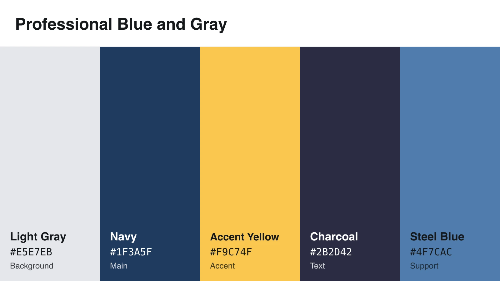
Why it works: Blue feels steady, and gray keeps the page quiet so yellow can point at your key number.
Design tip: Set text in charcoal, which scores 10.8:1 on light gray. Save steel blue for large headers and chart shapes.
Accessibility caution: Yellow nearly vanishes on light gray at 1.27:1. Put it on navy instead, where it scores 7.27:1.
2. Modern Teal and Coral
Best for: marketing, startups, product explainers, and social media
| Cream | Teal | Coral | Deep Slate | Aqua | |
|---|---|---|---|---|---|
| HEX | #FFF8E7 | #008080 | #FF6B6B | #2F3E46 | #A8DADC |
| Role | Background | Main | Accent | Text | Support |
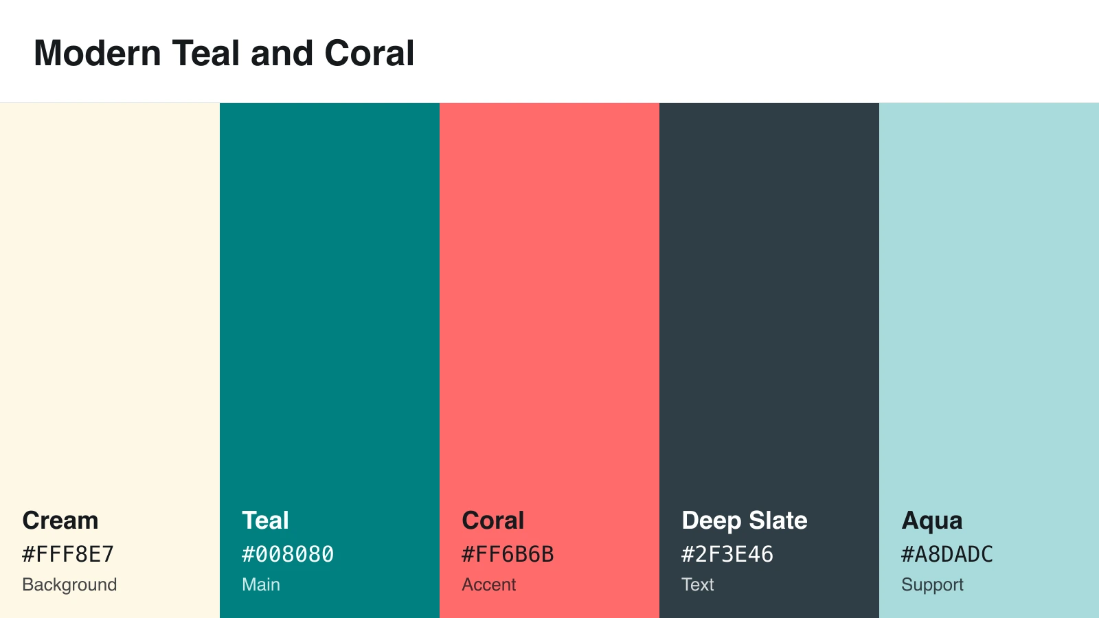
Why it works: Teal feels modern, and coral adds warmth.
Design tip: Use coral as a fill for buttons and badges, with large, bold deep slate text on top. Teal text on cream passes at exactly 4.5:1, so don’t lighten it.
Accessibility caution: Coral icons on cream score 2.62:1, below the 3:1 minimum. Outline them in deep slate.
3. Minimal Black, White, and Accent Red
Best for: editorial graphics, bold statistics, reports, and comparisons
| White | Light Gray | Red Accent | Black | Medium Gray | |
|---|---|---|---|---|---|
| HEX | #FFFFFF | #F2F2F2 | #E63946 | #111111 | #A0A0A0 |
| Role | Background | Panels | Accent | Text | Dividers only |
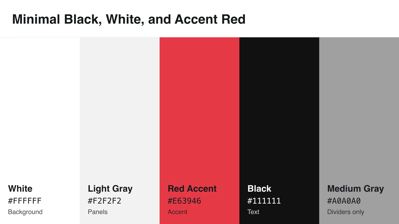
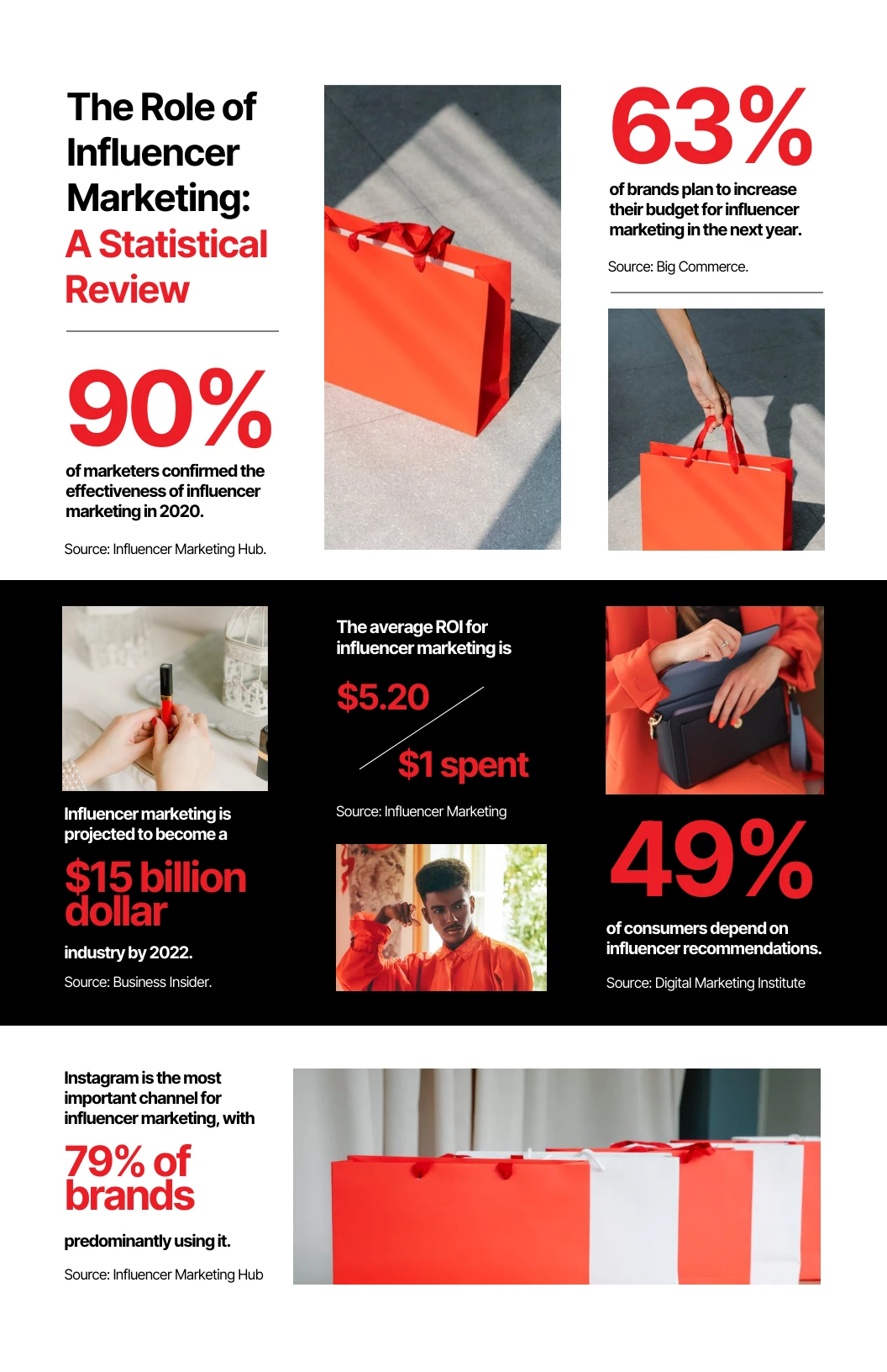
Why it works: Fewer colors mean less noise, and red pulls the eye to one point.
Design tip: Use red for one big number or one key bar. At 4.16:1 on white, it works for large text but not small text.
Accessibility caution: Medium gray scores 2.61:1 on white. Never use it for labels.
4. Earthy Green and Terracotta
Best for: sustainability, agriculture, health, wellness, and nature topics
| Sand | Forest Green | Terracotta | Dark Olive | Sage | |
|---|---|---|---|---|---|
| HEX | #E9D8A6 | #2D6A4F | #C76F51 | #3A4A3F | #95A78D |
| Role | Background | Main | Accent | Text | Support |
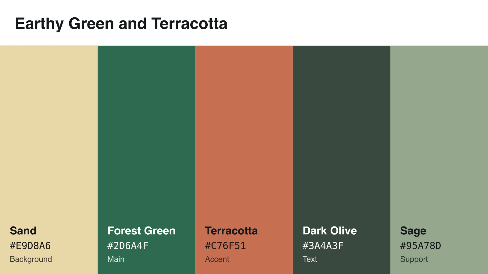
Why it works: Earth tones match topics about land, food, and the outdoors.
Design tip: Set text in dark olive, which scores 6.65:1 on sand. Use terracotta for large blocks with bold white text.
Accessibility caution: Green and terracotta form a red-green pair with nearly equal lightness, so label both data series.
5. Bright Data Visualization Palette
Best for: charts, dashboards, and comparisons with many categories
| Blue | Green | Orange | Red | Purple | |
|---|---|---|---|---|---|
| HEX | #277DA1 | #43AA8B | #F8961E | #F94144 | #9B5DE5 |
| Role | Key series | Series | Series | Series | Series |
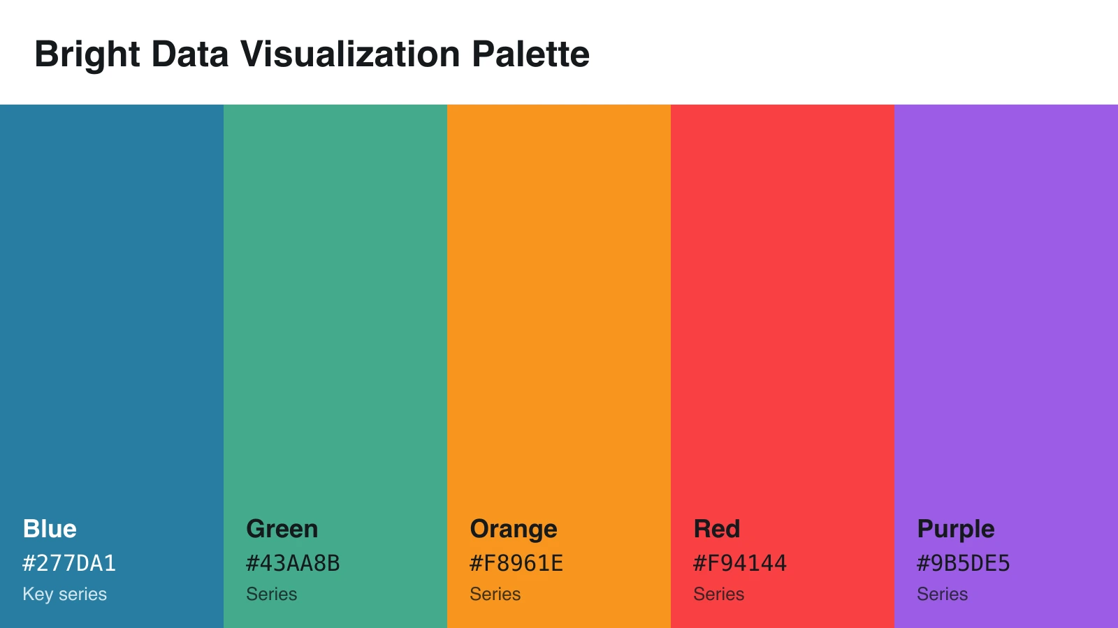
Why it works: Five distinct hues help readers tell categories apart.
Design tip: Add a white background and #222222 text. Give blue to your most important series, since it’s the only color here that passes for text on white.
Accessibility caution: No two of these colors reach 3:1 against each other. Add direct labels and thin white gaps between bars or slices.
6. Soft Pastel Palette
Best for: education, lifestyle, wellness, and gentle explainers
| Cream | Lavender | Pink | Sky Blue | Pale Blue | |
|---|---|---|---|---|---|
| HEX | #FFF1E6 | #CDB4DB | #FFC8DD | #A2D2FF | #BDE0FE |
| Role | Background | Main | Accent | Support | Support |
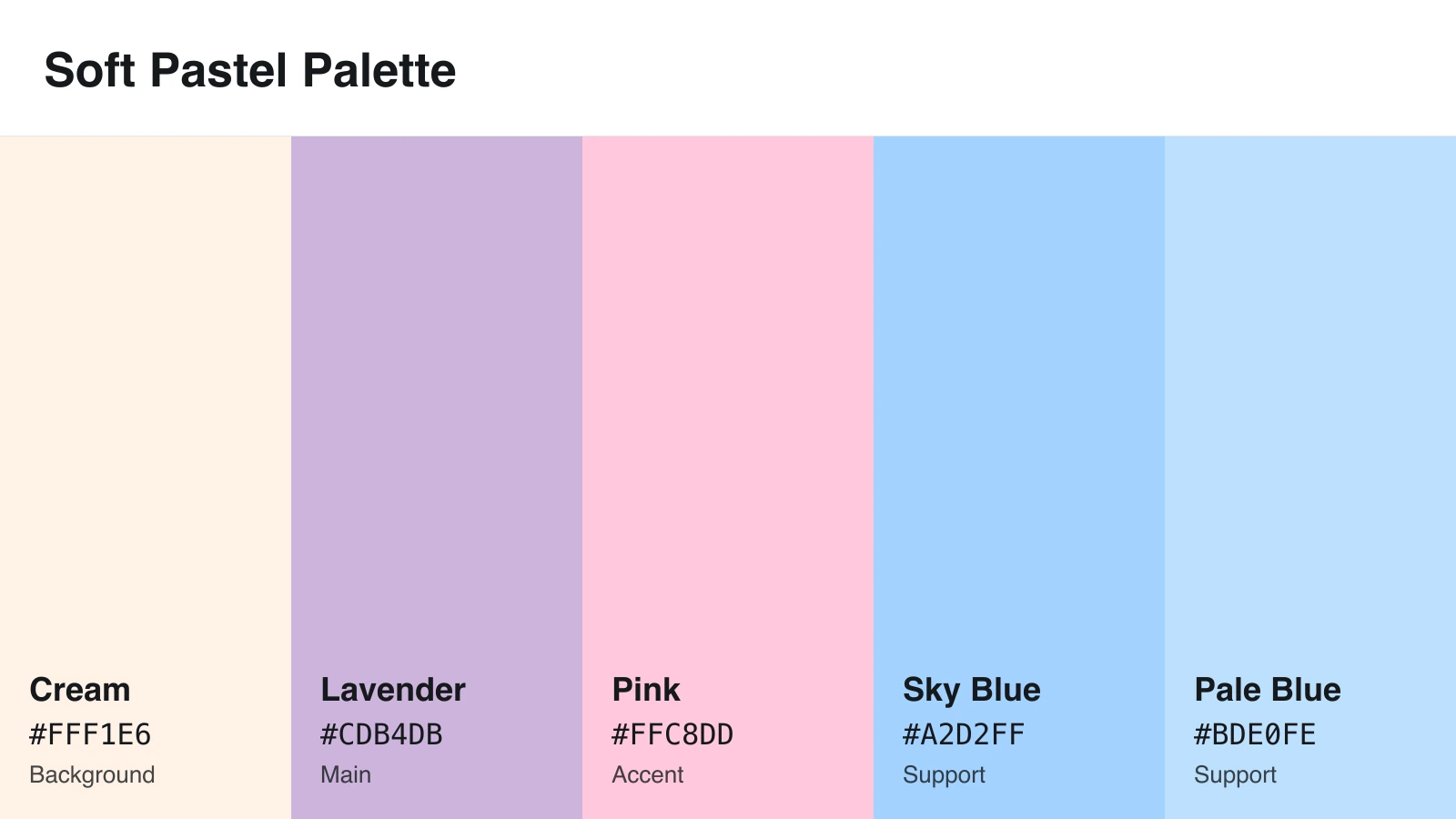
Why it works: Pastels feel friendly and approachable.
Design tip: Use pastels as blocks behind #333333 text, which scores at least 6.70:1 on every pastel here.
Accessibility caution: No pastel reaches 3:1 on cream. Never use pastels for text or thin icons.
7. High-Contrast Yellow and Navy
Best for: presentations, posters, and mobile-first social posts
| Navy | Blue | Yellow | White | Gray | |
|---|---|---|---|---|---|
| HEX | #001D3D | #003566 | #FFC300 | #FFFFFF | #E5E5E5 |
| Role | Background | Panels | Accent | Text | Muted text |
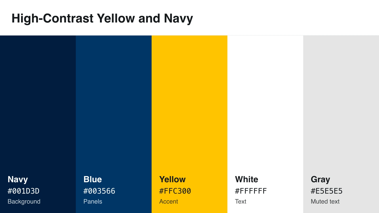
Why it works: It’s the strongest palette here for text. White on navy scores 16.8:1.
Design tip: Choose it when your graphic will shrink on phones. Use yellow for key numbers and arrows.
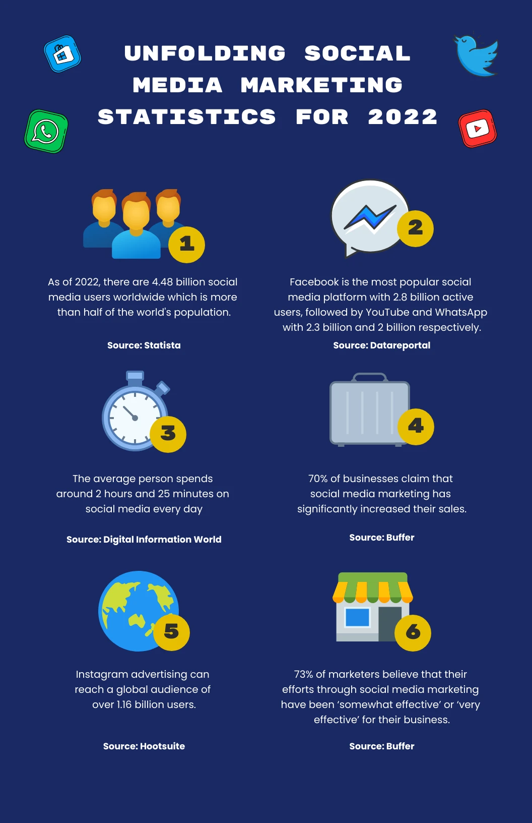
Accessibility caution: The two navies sit only 1.36:1 apart, so add a thin border to panels.
8. Healthcare Blue and Aqua
Best for: healthcare, medical, science, and nonprofit topics
| White | Medical Blue | Light Aqua | Deep Blue | Soft Gray | |
|---|---|---|---|---|---|
| HEX | #FFFFFF | #0077B6 | #90E0EF | #023E8A | #F1F5F9 |
| Role | Background | Main | Accent | Text | Panels |
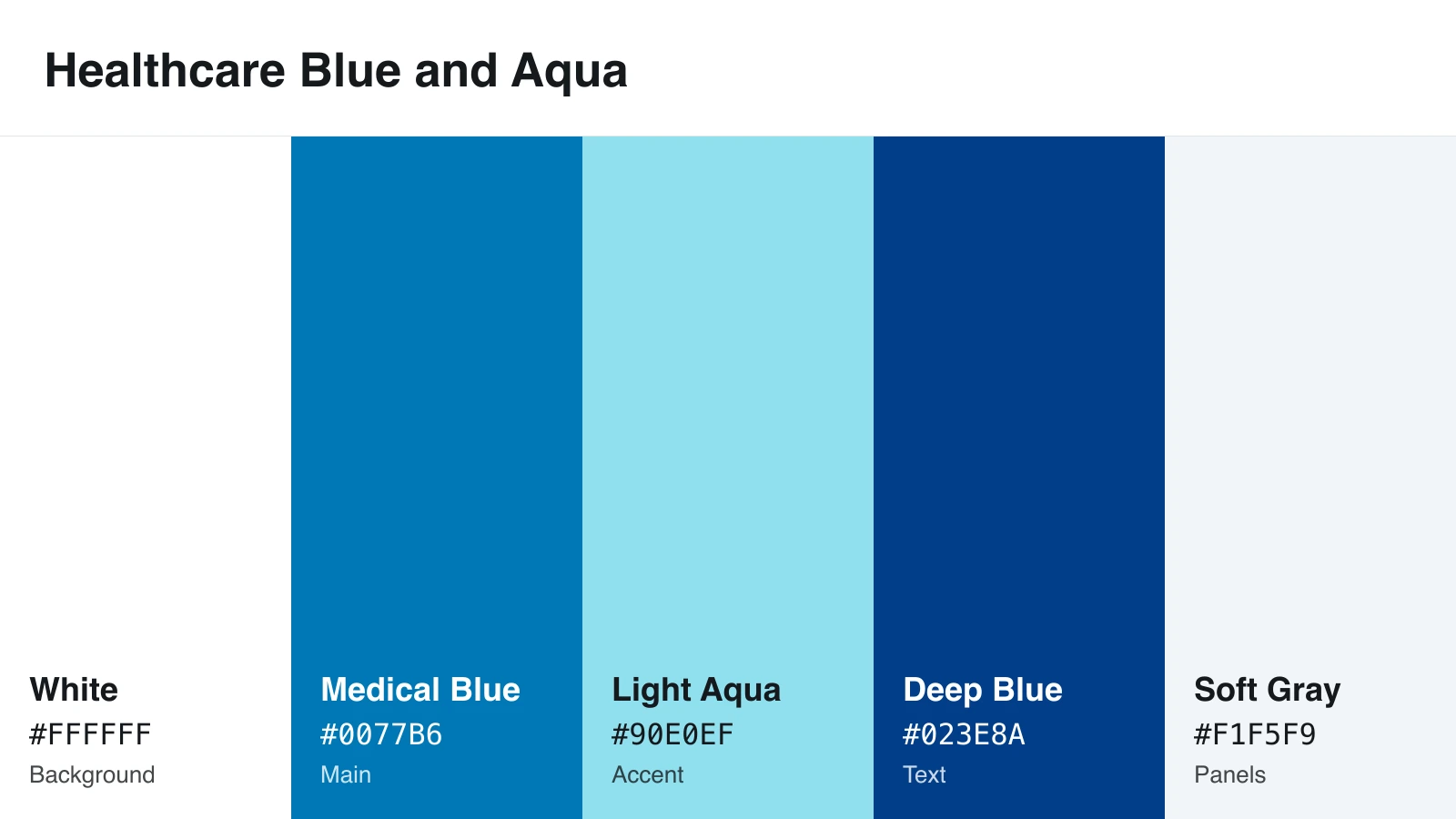
Why it works: Blue and white keep a health topic calm and uncluttered.
Design tip: Set text in deep blue, and use light aqua only as a fill behind it.

Accessibility caution: Medical blue passes on white at 4.86:1 but fails on soft gray at 4.44:1. Inside gray panels, switch small text to deep blue.
9. Warm Sunset Palette
Best for: travel, events, food, and lifestyle topics
| Cream | Orange | Coral | Plum | Gold | |
|---|---|---|---|---|---|
| HEX | #FEF3C7 | #F97316 | #FB7185 | #6B214F | #FACC15 |
| Role | Background | Main | Accent | Text | Support |
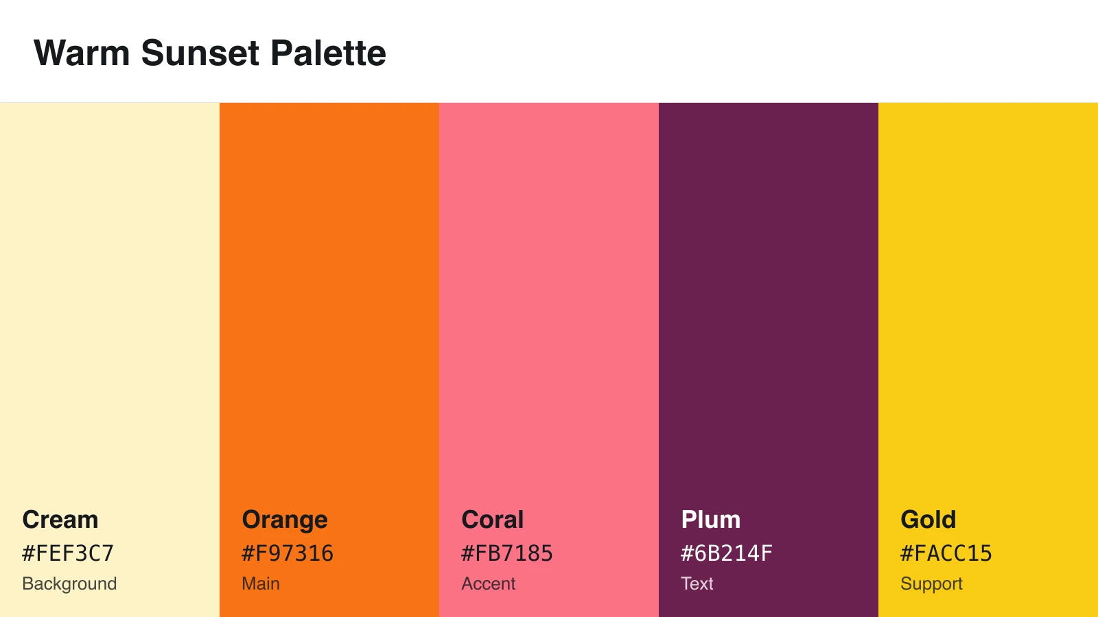
Why it works: Warm colors feel lively and emotional.
Design tip: Set all text in plum, which scores 9.64:1 on cream.
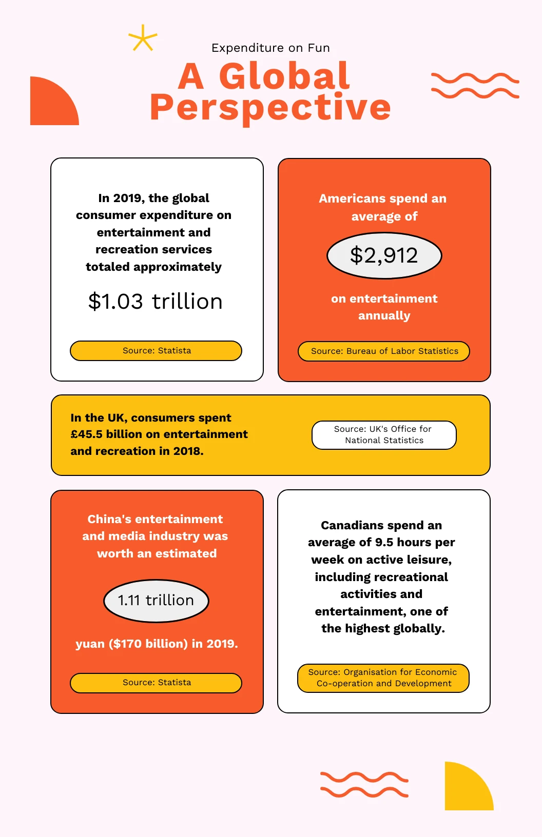
Accessibility caution: White text on orange scores 2.80:1 and fails even for headlines. Orange and coral also look identical in black and white, so don’t use them as two chart categories.
10. Luxury Plum and Gold
Best for: premium brands, annual reports, and awards
| Plum | Ivory | Gold | Burgundy | Charcoal | |
|---|---|---|---|---|---|
| HEX | #3D1E3D | #FFFFF0 | #D4AF37 | #800020 | #2C2C2C |
| Role | Background | Cards and text | Accent | Text on ivory | Dark panels |
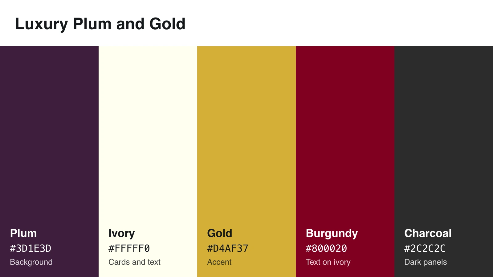
Why it works: Deep purple and metallic gold look rich and polished.
Design tip: Keep gold on dark colors. Gold on plum scores 6.88:1.
Accessibility caution: Gold on ivory scores 2.08:1. On ivory cards, use burgundy for emphasis.
11. Clean Monochromatic Blue
Best for: data-heavy reports, timelines, and low-to-high data
| White | Medium Blue | Sky Blue | Dark Blue | Mint White | |
|---|---|---|---|---|---|
| HEX | #FFFFFF | #134074 | #8DA9C4 | #0B2545 | #EEF4ED |
| Role | Background | Main | Accent | Text | Panels |
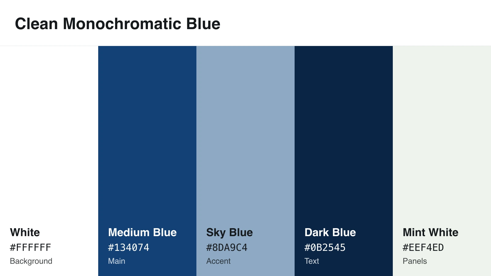
Why it works: Shades of one color create order without clutter.
Design tip: For data steps, use dark blue or medium blue but not both, since they sit only 1.47:1 apart. Follow with sky blue, then mint white.
Accessibility caution: Sky blue bars on white score 2.44:1. Outline or label them.
12. Playful Bright Palette
Best for: children’s education, entertainment, and social content
| White | Blue | Pink | Yellow | Purple | |
|---|---|---|---|---|---|
| HEX | #FFFFFF | #3A86FF | #FF006E | #FFBE0B | #8338EC |
| Role | Background | Main | Accent | Support | Headings |
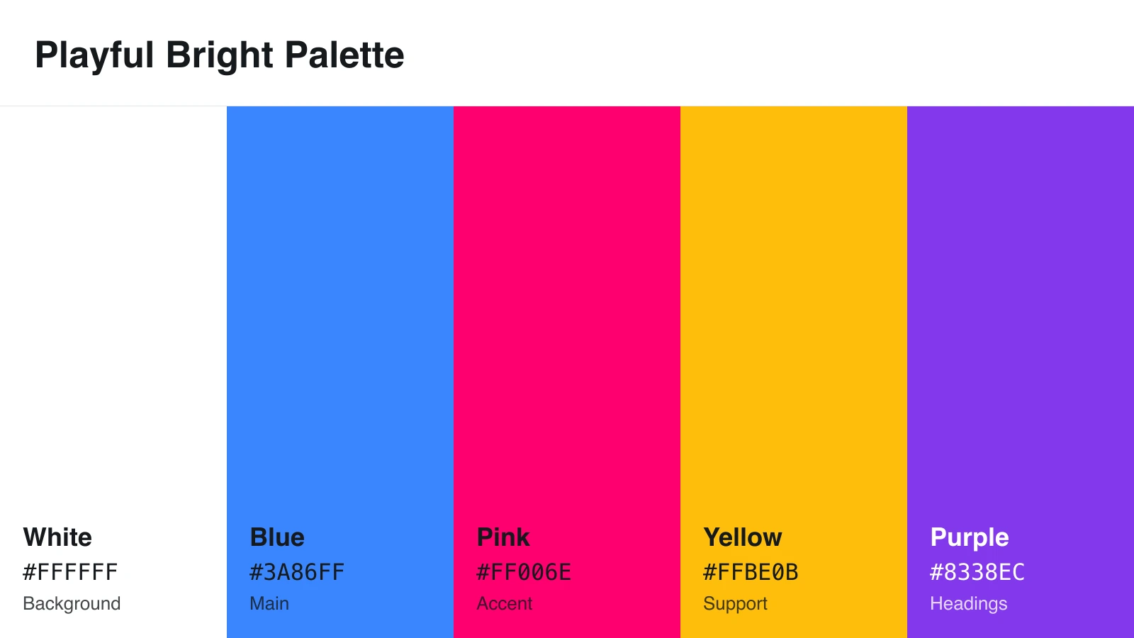
Why it works: Bright colors grab attention quickly.
Design tip: Let blue lead, give the other colors small jobs, and add #111111 for body text.
Accessibility caution: Yellow on white scores 1.66:1, so put black text on yellow blocks instead. Pink and blue share almost the same lightness, so label them in charts.
13. Neutral Beige and Charcoal
Best for: elegant reports, editorial, and professional presentations
| Off White | Beige | Taupe | Charcoal | Muted Brown | |
|---|---|---|---|---|---|
| HEX | #F8F4EF | #EAE0D5 | #C6AC8F | #22333B | #5E503F |
| Role | Background | Panels | Accent | Text | Secondary text |
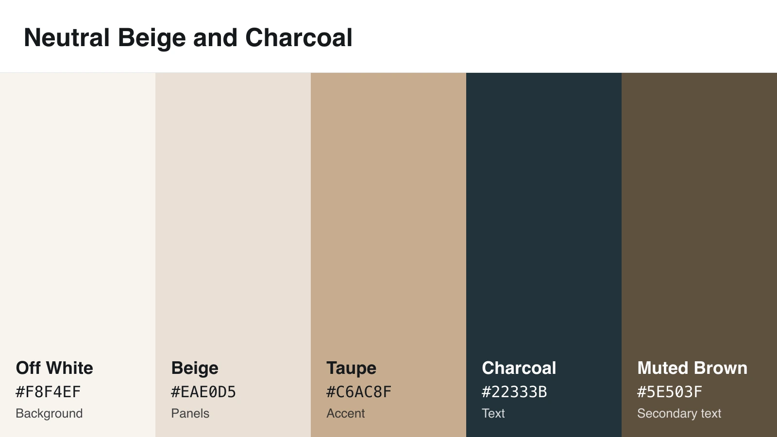
Why it works: Neutrals look calm and mature.
Design tip: Every text pair here passes. Draw chart data in charcoal and muted brown.
Accessibility caution: Taupe on off white scores 1.97:1, so keep it decorative. Give beige panels a thin border.
14. Science and Research Palette
Best for: scientific figures, research posters, and technical graphics
| Blue | Orange | Bluish Green | Reddish Purple | Gray | |
|---|---|---|---|---|---|
| HEX | #0072B2 | #E69F00 | #009E73 | #CC79A7 | #999999 |
| Role | Key series | Series | Series | Series | “Other” group |
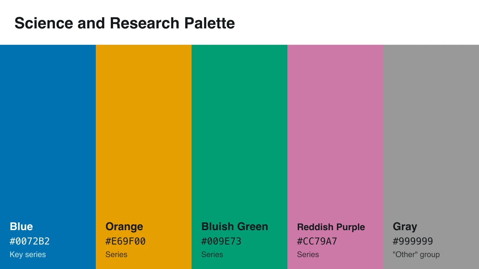
Why it works: The first four colors come from the Okabe-Ito palette, which scientists Masataka Okabe and Kei Ito designed for colorblind viewers. The gray comes from a version in the R Graphics Cookbook.
Design tip: Add #111111 text, direct labels, and line styles or markers.
Accessibility caution: Colorblind-safe doesn’t mean high contrast. Gray and reddish purple score 1.07:1 against each other, so they merge in black and white.
15. Brand-Friendly Neutral + Accent Palette
Best for: branded infographics, company reports, and sales decks
| White | Light Gray | Your Brand Color | Accent Amber | Dark Gray | |
|---|---|---|---|---|---|
| HEX | #FFFFFF | #F3F4F6 | Your HEX | #F59E0B | #374151 |
| Role | Background | Panels | Main | Accent | Text |
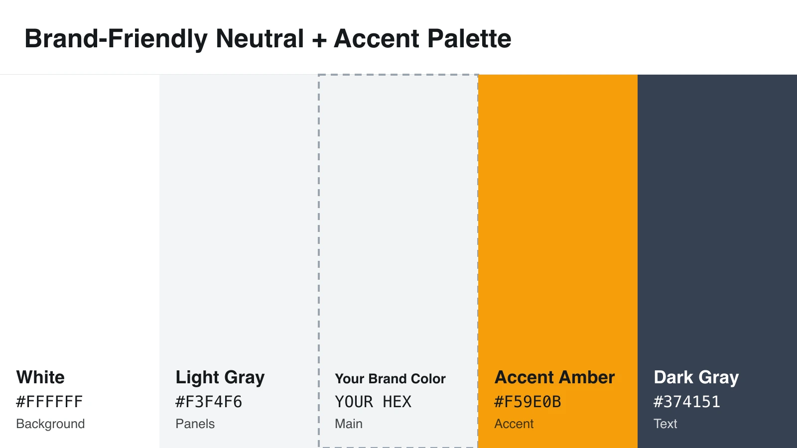
Why it works: Neutrals give your brand color room to lead.
Design tip: Test your brand color on white. At 4.5:1 or higher, use it for text. From 3:1 to 4.49:1, use it for headings and shapes. Below 3:1, use it only as a fill.
Accessibility caution: Amber on white scores 2.14:1. Put dark gray text on amber instead.
Choose the Right Infographic Color Scheme
Decide what your colors need to do before you decide how they look. Professional readers usually expect muted blues and grays. Younger audiences often respond to brighter colors. Scientific readers need data colors that stay clear for colorblind viewers.
Then match colors to the feeling you want.
| Feeling | Colors to try | Palettes |
|---|---|---|
| Trust | Blue, navy, and gray | 1, 11 |
| Growth or nature | Green and earth tones | 4 |
| Urgency | Red and orange | 3, 9 |
| Creativity | Purple and bright mixes | 12 |
| Calm | Soft blues, greens, and neutrals | 6, 8, 13 |
| Premium | Plum, gold, black, and ivory | 10 |
Treat these as common associations, not rules. One marketing study linked blue with competence and red with excitement. A 2020 study of 4,598 people in 30 countries found that people mostly share the same color-emotion links, but their country still shapes those links.
If you have brand colors, put them in the main or accent slot and keep text neutral, as palette 15 does.
Limit Your Infographic to 3–5 Colors
Too many colors bury your message. When everything stands out, nothing does.
Most infographics need a background, a text color, and one main color. A secondary color and an accent bring you to five. Background and text count toward the total, but a lighter tint of a color you already use doesn’t.
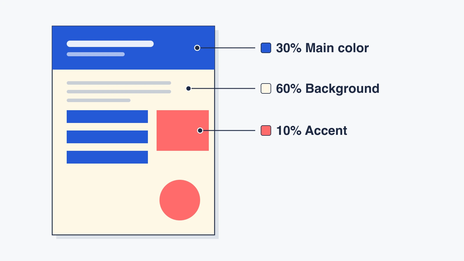
The 60-30-10 rule, a guideline borrowed from interior design, helps you balance them.
| Share | Role | Where it goes |
|---|---|---|
| 60% | Background | Page background and empty space |
| 30% | Main color | Header band, section titles, and main chart shapes |
| 10% | Accent | One key number, a callout, or a single highlighted bar |
Treat the numbers as rough targets. Charts need even more restraint. The UK government’s Analysis Function recommends a limit of four categories for basic charts. If you need more than seven colors, Datawrapper suggests you group categories or switch chart types.
Know the Basic Color Schemes for Infographics
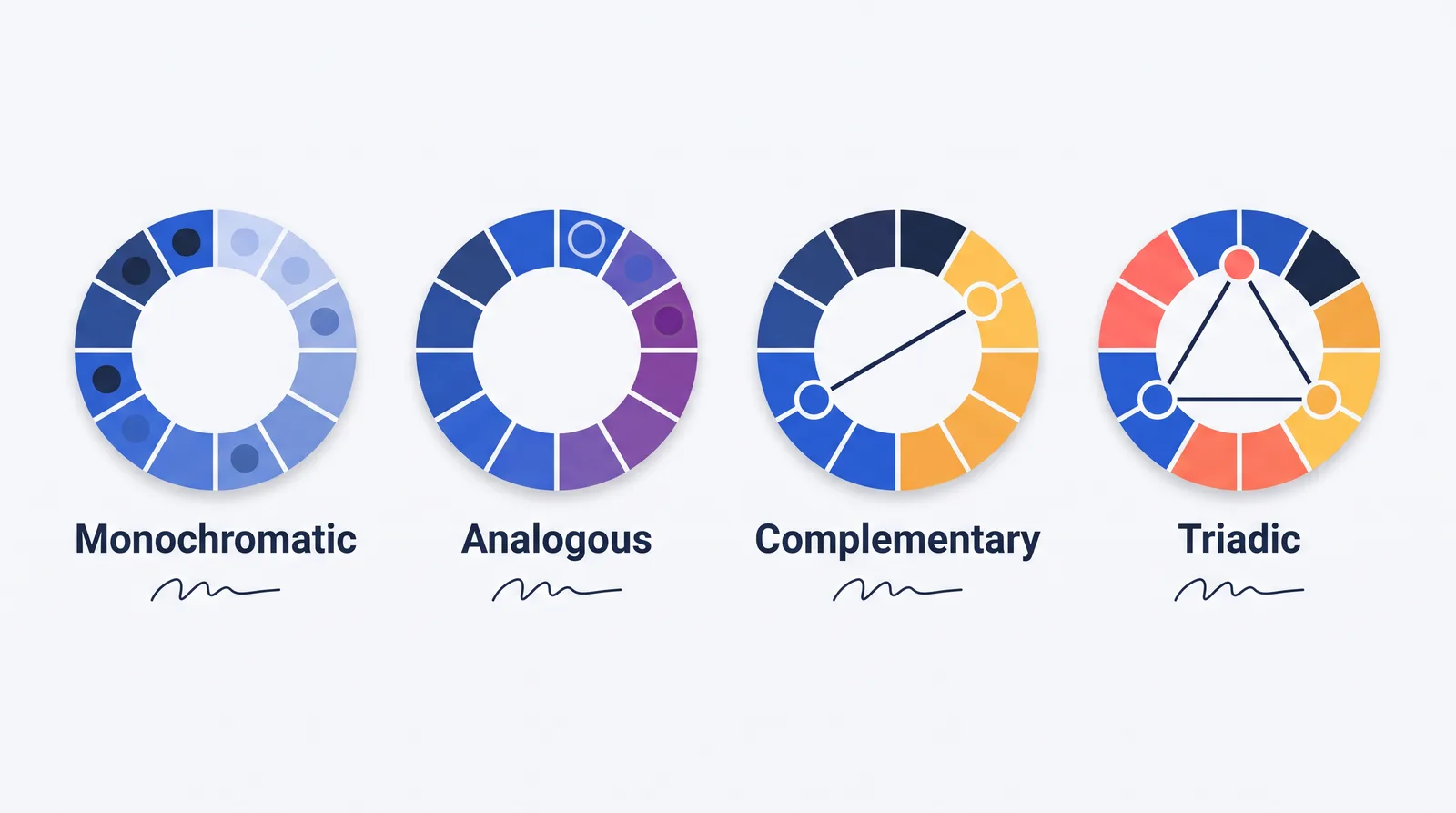
A color scheme picks colors based on where they sit on the color wheel. No official list exists, and guides count five to seven types.
Monochromatic
This scheme uses light and dark shades of one color, like palette 11. It looks clean and suits low-to-high data.
Analogous
This scheme uses neighboring colors on the wheel, like blue and blue-green. It feels calm, but neighbors often share lightness, so add a dark text color.
Complementary
This scheme uses two opposite colors, like blue and orange. It creates strong contrast for callouts and comparisons.
Split-Complementary
This scheme uses one base color plus the two colors beside its opposite. It gives you contrast that feels less harsh.
Triadic
This scheme uses three evenly spaced colors, like red, yellow, and blue. It looks lively, so balance it with white or gray.
Tetradic
This scheme uses two complementary pairs. It turns chaotic fast, so pick one main color and give the others small jobs.
Neutral with Accent Color
This scheme pairs grays, beiges, black, or white with one bold color, like palettes 3, 13, and 15. It’s one of the easiest schemes for non-designers because the accent has an obvious job.
Palette Types for Charts
ColorBrewer sorts chart palettes into three types. Sequential palettes run light to dark for low-to-high values. Diverging palettes put a light color in the middle and dark colors at both ends, for data with a midpoint. Qualitative palettes use different hues for separate categories.
Make Infographic Colors Readable and Accessible
About 1 in 12 men and 1 in 200 women have color vision deficiency, often called color blindness. It makes some colors hard to tell apart, and red and green cause trouble most often.
Start with text. Dark text on a light background is safest. WCAG doesn’t round scores, so 4.49:1 fails.
Watch your accent colors closely. In 9 of the 13 non-chart palettes above, the accent scores below 3:1 on its own background. Use accents as fills behind dark text, not as text.
Never rely on color alone. WCAG states: “Color is not used as the only visual means of conveying information, indicating an action, prompting a response, or distinguishing a visual element.” That rule means adding labels, icons, or patterns. Maureen Stone, then research director at Tableau, told Built In: “If it’s absolutely critical, don’t encode it with color alone.”
Keep meanings consistent, too. If blue means “this year” in one chart, don’t use it for another category later.
Test your palette before you publish:
- Contrast: Check every text and background pair in the WebAIM Contrast Checker, including text on panels.
- Chart shapes: Make sure bars, lines, and icons reach 3:1 against neighboring colors, or add labels.
- Color blindness: In Chrome DevTools, open the Rendering panel and use Emulate vision deficiencies.
- Grayscale: View a black-and-white version. Colors with different meanings should still look different.
- Mobile: Preview on a phone. A 1000px graphic on a 360px screen shrinks to about a third of its size, so large headings can become small text that needs 4.5:1.
Use Tools to Create and Test Infographic Color Schemes
Palette generators help you find colors fast. Contrast checkers and simulators tell you whether those colors work.
| Tool | Type | What it does |
|---|---|---|
| Coolors | Generator | Builds palettes, with a contrast checker and color blindness simulator |
| Adobe Color | Generator | Creates palettes from color wheel rules and checks accessibility |
| Canva Color Palette Generator | Generator | Pulls four colors and HEX codes from a photo |
| Khroma | Generator | Learns which colors you like and suggests palettes |
| Color Hunt | Inspiration | Offers thousands of free, hand-picked palettes |
| WebAIM Contrast Checker | Contrast | Shows pass or fail for text and graphics |
| Accessible Colors | Contrast | Suggests the closest passing color for a failing pair |
| ColorBrewer | Data palettes | Offers chart palettes with a colorblind-safe filter |
| Viz Palette | Testing | Previews chart colors under color blindness and flags lookalike colors |
| Canva, Venngage, Visme, Piktochart, and Figma | Design | Build the infographic and save your palette as brand colors or styles |
Match Infographic Color Schemes to Use Cases
The right palette depends on your topic. A 2013 study found that colors tied to meaning, like blue for oceans, helped people read charts faster.
| Infographic type | Recommended colors | Palette | Why |
|---|---|---|---|
| Business report | Navy, gray, white, and a yellow accent | 1 | Professional, with strong text contrast |
| Healthcare | Blue, light aqua, and white | 8 | Calm, clean, and easy to read |
| Sustainability | Green, sage, terracotta, and sand | 4 | Fits nature and land topics |
| Social media | Teal and coral, or navy and yellow | 2, 7 | Stands out in a feed and holds up on small screens |
| Scientific | Blue, orange, bluish green, and gray | 14 | Separates categories for colorblind readers |
| Luxury or premium | Plum, gold, and ivory | 10 | Rich and polished |
| Education | Blue, yellow, purple, and white | 12 | Friendly and energetic |
| Data dashboard | Distinct category colors plus neutrals | 5 | Helps readers tell categories apart |
| Branded report | Neutral base plus your brand color | 15 | Keeps your brand consistent without clutter |
FAQ About Infographic Color Schemes
What is the best color to use for an infographic?
No single color works best, but blue is one of the safest professional choices. People often link it with competence, and it pairs well with gray and white.
What are the 7 basic color schemes?
Most guides list monochromatic, analogous, complementary, split-complementary, triadic, tetradic, and neutral or achromatic, which means black, white, and grays. Some swap the last one for a square scheme.
What are the 5 main color schemes?
The five most common are monochromatic, analogous, complementary, triadic, and tetradic. Beginners should start with monochromatic, complementary, or neutral with accent.
What are the 5 elements of an infographic?
Guides don’t agree on one list, but five elements come up often: a clear message, accurate data, visual hierarchy, strong graphics, and readable color and type. Visual hierarchy is the order in which readers notice things.
How many colors should be in an infographic?
Use 3–5 colors, counting background and text. Keep chart categories to four or fewer when you can.
What colors should you avoid in infographics?
Avoid light gray on white, pastel text on cream, and white text on orange or yellow. Don’t use red and green as the only way to separate data.