Infographic Design Tips: How to Create Clear, Professional Infographics
In this guide
- What Makes a Good Infographic?
- 1. Start With One Clear Goal
- 2. Choose the Right Type of Infographic
- 3. Build the Story Before You Design
- 4. Use Reliable Data and Cite Your Sources
- 5. Create a Simple Wireframe First
- 6. Create a Strong Visual Hierarchy
- 7. Keep the Layout Easy to Follow
- 8. Keep Text Short and Scannable
- 9. Choose Fonts That Are Easy to Read
- 10. Use a Limited, Consistent Color Palette
- 11. Use Icons, Illustrations, and Charts With Purpose
- 12. Use White Space to Prevent Clutter
- 13. Make Data Visualizations Clear, Not Clever
- 14. Design for the Platform Where You’ll Share It
- 15. Add Branding Without Overpowering the Design
- 16. Check Accessibility and Mobile Readability
- 17. Proofread, Test, and Revise Before Publishing
- Infographic Design Do’s and Don’ts
- The 5 Key Elements of an Infographic
- Key Principles of Infographic Design
- Quick Infographic Design Checklist
- FAQ About Infographic Design
- How We Put This Guide Together
By [Author name], [role] · Reviewed by [Reviewer name], [role] · Last updated: September 14, 2026
A strong infographic doesn’t just look good. It makes one important idea easy to understand at a glance.
An infographic mixes short text, numbers, charts, and icons to explain a topic. You might build one for a marketing report, a class project, a library program recap, or a social post.
Many infographics fail for the same reasons. They cram in too much, nothing stands out, and decoration buries the message.
You don’t need a design degree to fix that. You need a clear process, and this guide walks you through it, from planning to a final checklist.
What Makes a Good Infographic?
A good infographic is clear, focused, accurate, easy to scan, and useful to its audience. It explains one main message faster than text could. It repeats the same fonts, colors, and spacing throughout. And it suits both its readers and the platform they’ll see it on.
Does good design mean making it look fancy? No. Alberto Cairo teaches visual journalism at the University of Miami. He told UC Berkeley’s Advanced Media Institute that “the mark of a good infographic or data visualization project is its usability, its clarity and the story it tells.”
That doesn’t rule out style. Cairo has also said that infographics “can be lush, colorful, and fun,” as long as they keep people informed.
Use the CLEAR Method to Review Any Draft
CLEAR is a five-step review method built from the tips in this guide. Run it on every draft.
| Step | Ask yourself | Quick test |
|---|---|---|
| Clarify the message | Can I state the main point in one sentence? | Write it on a sticky note. Check each section against it. |
| Lay out the story | Where does the eye land first? | Squint. The key point should still stand out. |
| Evidence-check the data | Can someone trace every number? | Crop out one chart. Does it still show what it measures and its source? |
| Accessibility-test the design | Can everyone read it? | Read every label on your phone without zooming. |
| Revise for the platform | Does it fit where people will see it? | Shrink it to thumbnail size. Can you still read the title? |
1. Start With One Clear Goal
Decide what readers should learn before you pick a template, a color, or a chart.
Ask who the infographic is for, what they should remember, and what they should do next. Then write a one-sentence purpose statement, such as: “This infographic will show small business owners five ways to reduce website bounce rate.” Bounce rate is the share of visitors who leave after viewing one page.
Cut any fact, chart, or icon that doesn’t serve that sentence.
Also decide early where the infographic will appear. A blog post, PDF, slide deck, social post, email, and printed handout each need a different size and amount of text. Let the message drive the design, not the other way around.
2. Choose the Right Type of Infographic
The best format depends on the kind of information you need to explain.
Don’t force your content into a trendy template that doesn’t fit. A timeline, for example, tells readers your points happen in order. If they don’t, the layout misleads them.
The 7 Common Types of Infographics
No official list exists. Venngage names nine types, and Column Five names eight functional types. The seven below are among the most common, though list, résumé, roadmap, and flowchart designs show up often too.
| Type | Best for | Example use | Avoid it when |
|---|---|---|---|
| Statistical | Numbers, survey results, performance data | Marketing campaign results | You only have one number. Show it large and bold instead. |
| Informational | Explaining a concept or topic | “What is cybersecurity?” | Your content is mostly numbers |
| Timeline | Events in order | Company history | Your items have no real sequence |
| Process | Step-by-step instructions | How to apply for a grant | The steps branch into choices. Use a flowchart. |
| Comparison | Differences between options | Product A vs. Product B | You aren’t judging the options on the same points |
| Geographic | Data tied to places | Regional sales by state | Location isn’t really the point |
| Hierarchical | Rankings, structures, or levels | An org chart or Maslow’s hierarchy | Your items are equal, or you need to show exact amounts |
3. Build the Story Before You Design
A clear story gives your infographic a logical flow. The Nielsen Norman Group, a user experience research firm, recommends putting the conclusion first on screens and the details after.
So lead with the takeaway. Your title states the main finding. Then the rest of the infographic follows a simple structure, shown here for a remote work infographic:
| Part | Example |
|---|---|
| Problem | Remote teams struggle with communication |
| Key points | Too many meetings, unclear expectations, too many tools |
| Solution | Set team rules, share updates in writing, agree on priorities |
| Call to action | Download the team checklist |
Write titles as findings, not topics. “Email Drove a Third of Our Webinar Signups” tells readers something. “Webinar Signup Statistics” makes them work it out.
4. Use Reliable Data and Cite Your Sources
Your infographic is only as trustworthy as its weakest number.
Use credible, current sources, and save each link as you go. Then trace each statistic back to where it started. Researcher Mike Caulfield’s SIFT method for checking information calls this step “trace.” Cite the original study, not the blog post that quoted it.
Check the math too. Pie chart slices should add up to 100%, and chart shapes should match the real numbers. Before any number goes into your design, run this check:
| Check | Ask yourself |
|---|---|
| Verified | Did I read the original source? |
| Dated | Does the graphic show the date of the data? |
| Saved | Do I have the link for the footer? |
| Labeled | Does every chart say what it measures? |
| Supported | Did I cut every claim I can’t back up? |
Finally, add a source line at the bottom. The U.S. Data Visualization Standards list a source as a standard part of a chart. A source line also stays attached when people share your image without your web page.
5. Create a Simple Wireframe First
A wireframe is a rough sketch of where each part of your infographic goes. It places the title, sections, charts, call to action, and source line before you pick colors or fonts.
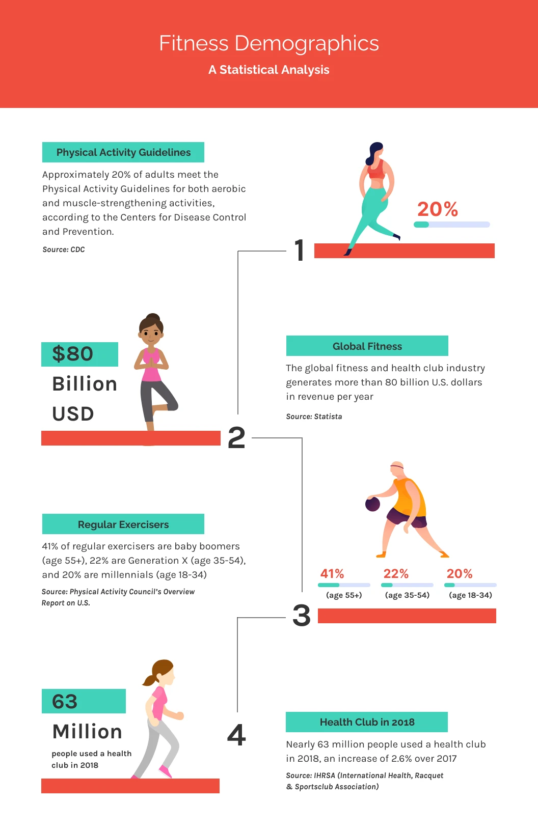
Paper and sticky notes work fine. So do gray boxes in Canva, Figma, PowerPoint, or Google Slides. A basic blog infographic might have six boxes: a title, three sections, one chart, and a footer.
Sketching first exposes clutter, gaps, and random placement early. That matters because placement carries meaning. The Nielsen Norman Group explains that people tend to see items placed close together as one group.
Even Piktochart’s tutorial on making an infographic in 30 minutes spends five of its seven steps on planning before you pick a template.
6. Create a Strong Visual Hierarchy
Visual hierarchy tells readers what to look at first, second, and third. As Visme’s description of one tutorial puts it, “our eyes don’t follow a specific order so you must create one.”
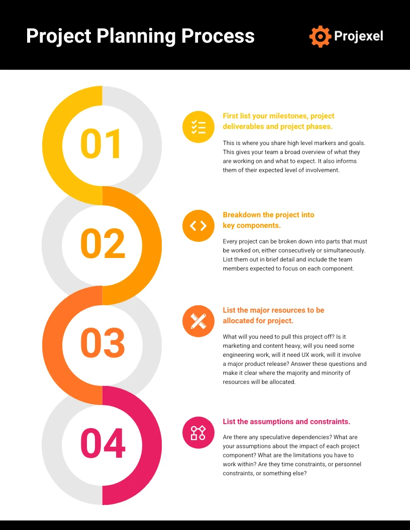
Make your title or key finding the largest, boldest element. Give headings the next size down, and keep supporting text smaller but readable. Color, spacing, numbers, and arrows can guide the eye too.
Keep emphasis rare, though. If everything is bold, nothing feels important.
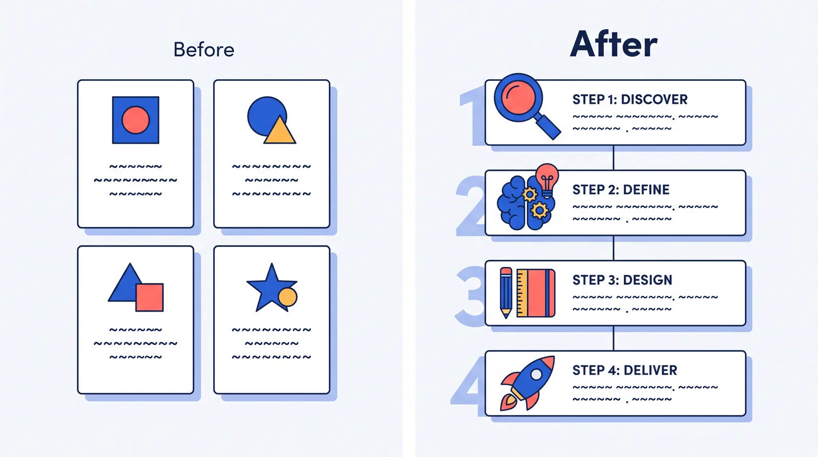
Here’s how a four-step grant guide changes with a stronger hierarchy. Designers measure type size in points.
| Before | After |
|---|---|
| 20-point title, 18-point step labels, 16-point body text | 48-point title, 24-point step labels, 16-point body text |
| Four identical boxes in a 2 × 2 grid with no clear reading order | One vertical line connecting steps 1 through 4 |
| Every line of text centered | Body text aligned left, title centered |
| Step numbers the same size as the labels | Large, faint step numbers behind each block |
Then try the Nielsen Norman Group’s squint test. Squint until the design blurs. Whatever still stands out is what readers see first, so make sure it’s your title or key number.
7. Keep the Layout Easy to Follow
Readers should know right away where to start, where to look next, and where to stop.
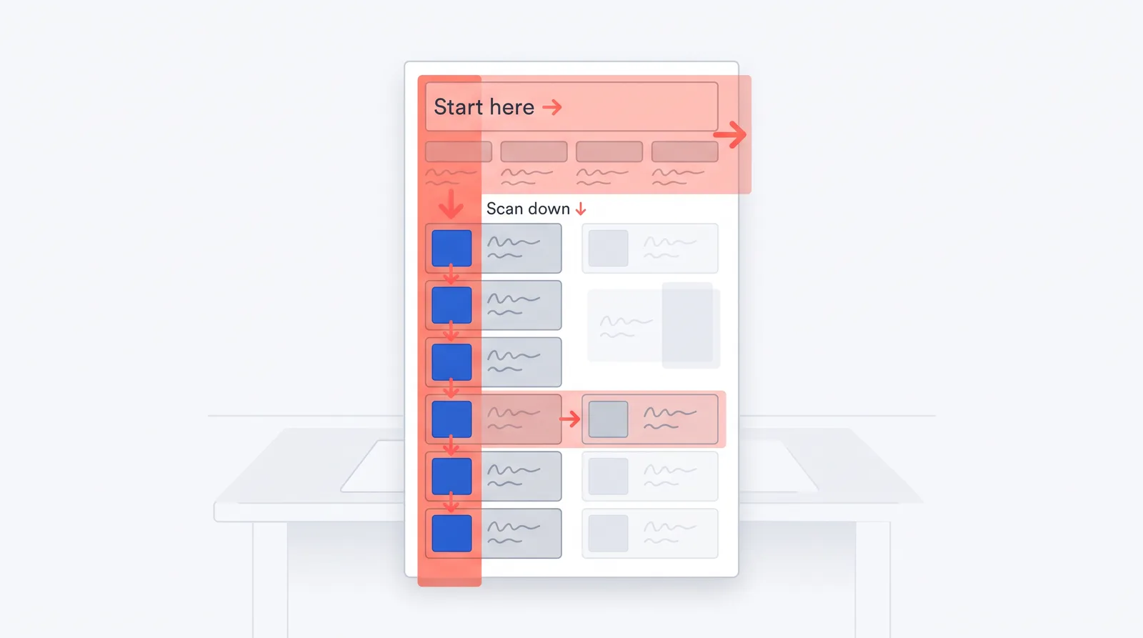
When content lacks clear structure, people often scan in an F shape, according to the Nielsen Norman Group. In its eyetracking research, readers moved across the top, then down the left side, and skipped content on the right. So put key information at the top and along the left edge.
Match the layout to your content:
| Layout | Use it for |
|---|---|
| Top to bottom | Most blog infographics and simple stories |
| Timeline | History or events in order |
| Side by side | Comparing two options |
| Grid | Tips with no set order |
| Numbered steps | A process with a clear sequence |
| Flowchart | Decisions with more than one path |
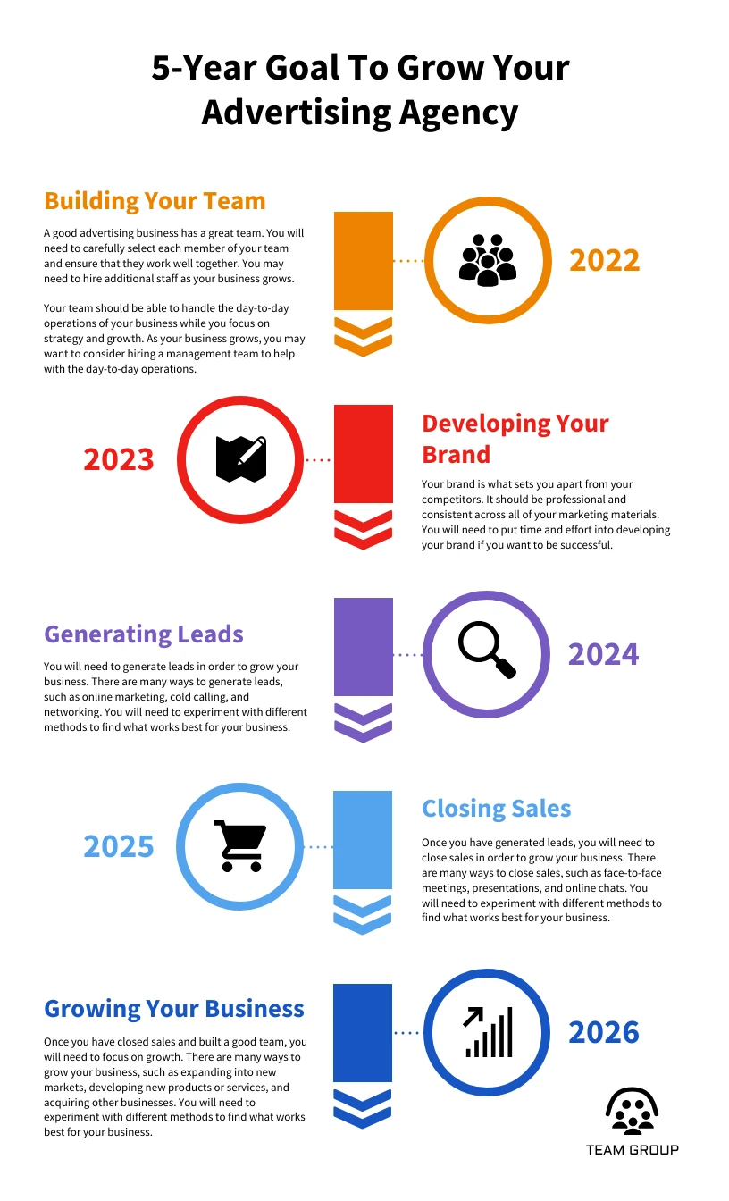
Group related items with spacing first, and add lines or background blocks only if you need them. Never scatter content to fill a gap. Random placement creates groups you didn’t intend.
8. Keep Text Short and Scannable
An infographic should not be a long article squeezed into a graphic.
People scan screens. In a 1997 Nielsen Norman Group study, 79% of test users scanned any new web page, and only 16% read word by word. Jakob Nielsen advised using half the words of normal writing, or fewer.
Use short headings, labels, and callouts instead of paragraphs. Our rule of thumb: aim for five to seven sections, a title under 10 words, and one or two short sentences per section.
For a general audience, lean toward fewer points. The CDC notes that readers with less education and training “may not comfortably process more than 5 pieces of information at a time.”
Here’s one line from a phishing awareness infographic, before and after editing. Phishing is a scam email that pretends to come from a trusted company.
Before, at 42 words: “One of the most common indicators that an email may be fraudulent is that the sender’s address, while appearing at first glance to be from a legitimate organization, contains subtle misspellings or uses a public domain rather than the organization’s own domain.”
After, at 7 words: Check the domain. support@paypa1.com is not PayPal.
Have a lot to say? Maybe your manager wants a 20-page report on one page. Don’t cram it in. Split it into a series or a carousel, a set of images people swipe through. Or keep the infographic short and link to the full report.
9. Choose Fonts That Are Easy to Read
Readable type makes an infographic look more professional and easier to follow.
Use two fonts, or three at most. The Interaction Design Foundation teaches this as a common design rule. Pair one heading font with one plain body font. One font in bold and regular weights also works.
Avoid script fonts, which look like cursive handwriting, for anything important. The U.S. Data Visualization Standards say: “Never use script or handwritten-style fonts in a data visualization.”
Size matters too. The CDC suggests at least 12-point type for print and 16-point type for the web. Check your text at the size people will see it, especially on a phone, and watch for tiny chart labels.
10. Use a Limited, Consistent Color Palette
Color should organize and highlight information, not compete with it.
A good starting point is 2 to 4 main colors. Many designers follow the 60-30-10 rule of thumb from interior design. Use a main color on about 60% of the design, a secondary color on 30%, and an accent color on 10%.
Save that accent for the one thing you most want noticed. Nigel Holmes, former graphics director at Time magazine, advises: “Start with black and white, and only introduce color when it has relevant meaning.”
If a brand color makes text hard to read, use a darker or lighter shade. Skip neon colors and clashing pairs. The U.S. Data Visualization Standards flag combinations that trouble people with color blindness, including red and green, blue and gray, and blue and purple.
11. Use Icons, Illustrations, and Charts With Purpose
Every visual should help explain your message.
Give each one a job. Icons label categories or steps, charts show data, maps show places, and arrows show a process. Use one icon family with the same line weight throughout, because mixed styles look pieced together.
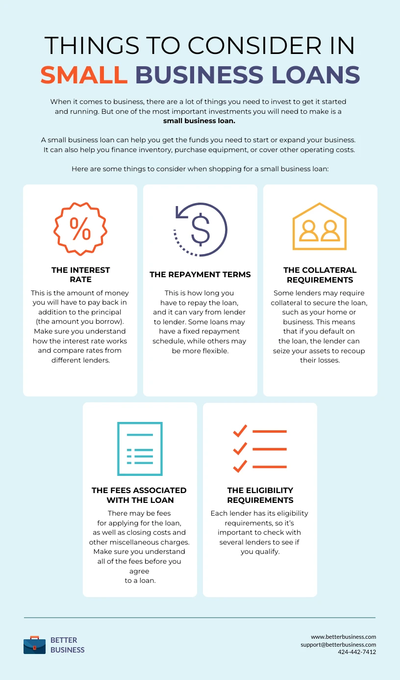
Don’t add visuals just to fill space. People remember pictures better than words, but the Nielsen Norman Group says that effect depends on meaningful images and grows stronger with concrete ones. Screen readers also skip images you mark as decorative, according to the W3C, the group that sets web accessibility standards.
Sometimes the best visual is one number. If you have a single key statistic, set it in large, bold type, as Column Five recommends for numbers.
Use only images you have the rights to use, such as those in your design tool’s licensed library.
12. Use White Space to Prevent Clutter
White space is the open area around text, icons, charts, and sections. It can be any color. It’s simply space you leave empty on purpose.
Designer Mark Boulton describes two kinds.
Macro white space is the big gaps, like margins and the space between sections.
Micro white space is the small gaps, like the space between lines or between an icon and its label.
White space separates ideas and draws the eye to what matters. In a 2004 study, Barbara Chaparro and her colleagues found that people understood online text better when it had margins. Readers also preferred it, though they read more slowly.
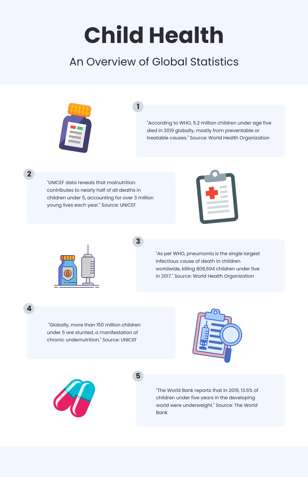
If your design feels crowded, cut content before you shrink the text. This example uses made-up numbers for a food bank:
| Before | After |
|---|---|
| 14 statistics in 11 panels | 5 statistics in 4 zones |
| 8-pixel margins | 32-pixel margins |
| Four background colors and a drop shadow on every panel | One background color and no shadows |
| Icons from three different sets | One icon family |
| Title: “2025 Impact Statistics” | Title: “$482,000 Became 94,000 Meals in 2025” |
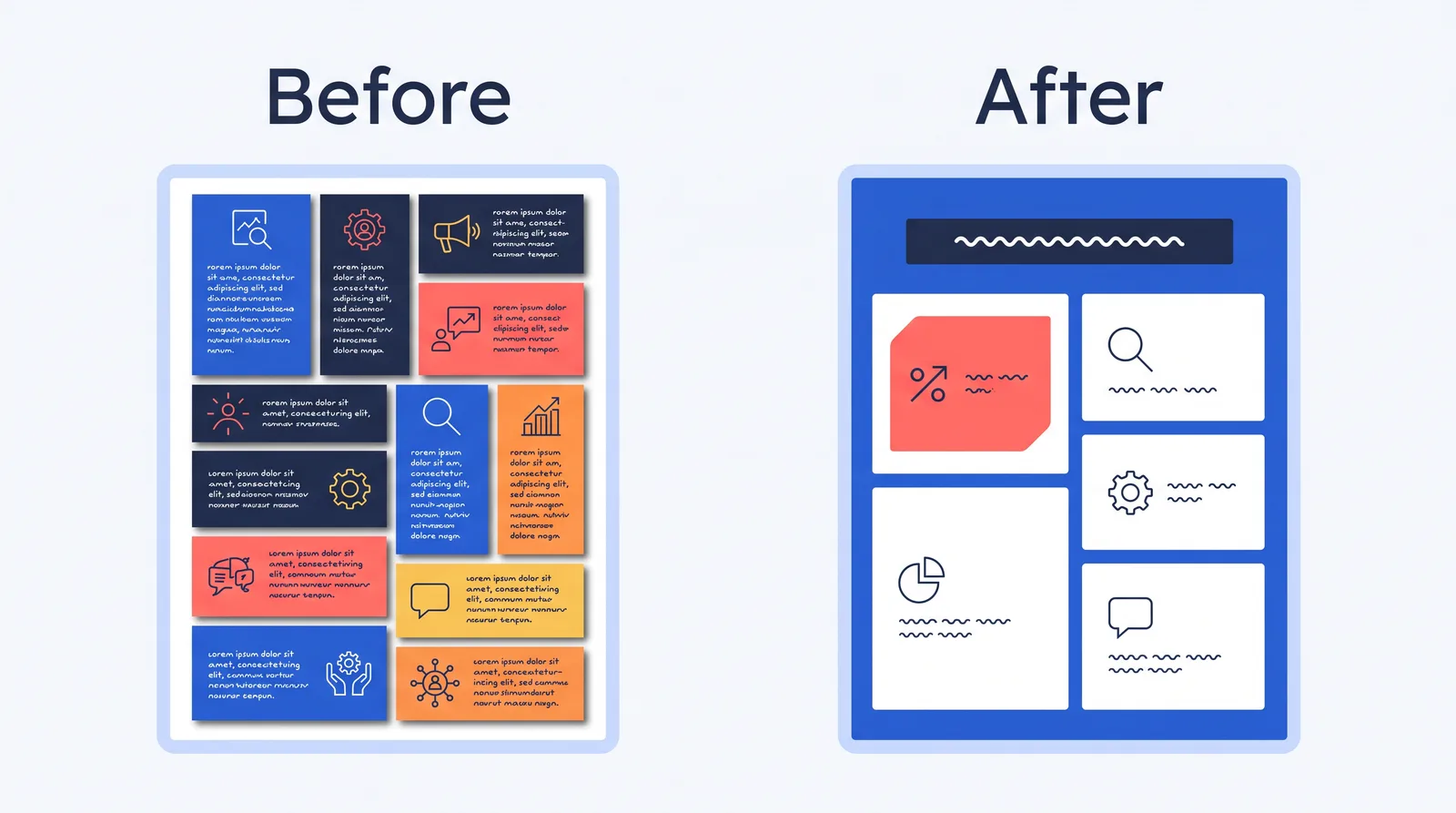
The other nine statistics can move into the article text around the image.
13. Make Data Visualizations Clear, Not Clever
A chart should make data easier to understand, not harder to decode.
Use bar charts to compare amounts and line charts to show trends over time. Use pie charts rarely, and only for simple parts of a whole. In a 1984 study, researchers William Cleveland and Robert McGill found that people judge length more accurately than angle or area. That’s why bars beat pies for comparisons.
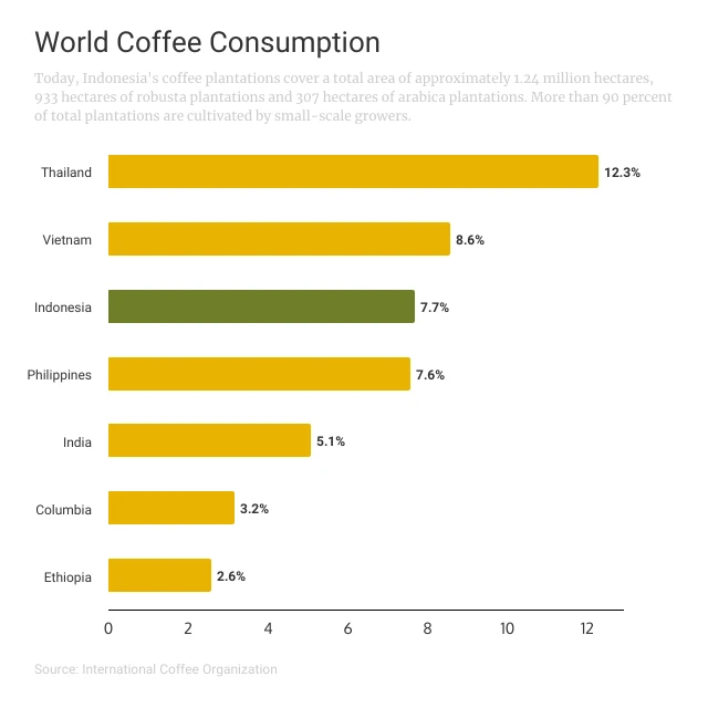
Avoid 3D charts. The U.S. Data Visualization Standards warn that 3D graphics “distort the visual calculation of volume.” Also cut extra gridlines and label your data directly.
Start bar charts at zero. The axis is the scale of numbers along a chart’s edge. If it starts above zero, bar lengths stop matching the numbers, the EU’s data visualization guide explains.
Line charts are more flexible, and their axis doesn’t always need to start at zero. Still, a 2020 study found that a cut-off axis made differences look bigger in both bar and line charts, even with a break symbol on the axis. If you cut off a line chart’s axis, label the scale clearly.
Watch out for software defaults too. Data visualization expert Stephanie Evergreen says, “Default charts tend to have too much clutter baked in.” Delete what doesn’t help, and state the takeaway in the chart title.
Here’s a redesign with made-up data. Sample size means the number of people or records behind the data.
| Before | After |
|---|---|
| 3D pie chart with 9 slices pulled apart | Horizontal bar chart, sorted longest to shortest |
| A 9-color legend with 4 similar blues | Labels at the end of each bar and one accent color |
| Decimal percentages that add up to 99.8% | Whole numbers that add up to 100% |
| Title: “Webinar Signup Sources” | Title: “Email Drove a Third of Webinar Signups” |
| No date range, sample size, or source | Date range, sample size, and a source line |
14. Design for the Platform Where You’ll Share It
Your infographic’s size, shape, and detail level should match where people will see it.
Long vertical designs suit blog posts, where readers scroll. They don’t suit every platform. Pinterest recommends a 2:3 shape, such as 1,000 × 1,500 pixels, and warns that feeds may cut off taller pins. A 2:3 shape is 2 units wide for every 3 units tall.
| Where it goes | Shape | What to change |
|---|---|---|
| Blog post | Tall portrait | Room for 5 to 7 sections, plus a text version beside it |
| 2:3 portrait | One headline and a few points, linked to the full version | |
| Portrait or square | A carousel with same-size slides, since Instagram’s publishing docs say it crops every slide to match the first | |
| Square | A simple, focused graphic. For image ads, LinkedIn’s ad specs recommend 1,200 × 1,200 pixels. | |
| Presentation | Wide 16:9 | Less text, split across several slides |
| Printable PDF | US Letter or A4 | Margins and 300 pixels per inch, the print industry standard |
| Report | Sized to the text column | A numbered caption and a source line |
| Email newsletter | Short and narrow | Key numbers repeated in the email text, in case images don’t load |
In Canva, pick the right size before you start, because resizing later may shift your layout. For exact dimensions on every platform, see our infographic size guide.
15. Add Branding Without Overpowering the Design
Branding should help people recognize you without pulling focus from the information.
Put your logo, website URL, and sources in a footer. The CRAAP test, a source-checking method many libraries teach, asks who published the information and whether contact details appear. A clear footer answers both questions.
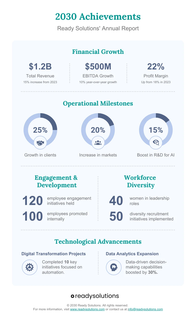
Keep branding quiet unless the main goal is promotion. A huge logo, heavy brand colors, or a sales pitch competes with your message.
Brand colors still follow accessibility rules. The Web Content Accessibility Guidelines, or WCAG, exempt logos from contrast rules. Text in brand colors, like your call to action, gets no such pass.
16. Check Accessibility and Mobile Readability
An accessible infographic works for as many people as possible, including people with low vision, color blindness, or screen readers. A screen reader is software that reads on-screen text aloud.
Accessibility specialist Sarah L. Fossheim writes that “accessible graphs also translate into better understandable graphs for everyone.”
For public schools, public libraries, and other state and local government bodies, it’s also the law. A Justice Department rule requires them to meet WCAG 2.1 Level AA online. Under an April 2026 extension, governments serving 50,000 or more people must comply by April 26, 2027, and smaller ones by April 26, 2028.
Check Color Contrast
Contrast ratio measures how much a color stands out from its background. WCAG’s text contrast and non-text contrast rules set these minimums:
| What you’re checking | Minimum contrast | WCAG rule |
|---|---|---|
| Regular text | 4.5:1 | 1.4.3, Level AA |
| Large text: 18 point, or 14 point bold | 3:1 | 1.4.3, Level AA |
| Chart bars, lines, and meaningful icons | 3:1 | 1.4.11, Level AA |
Small changes matter. Light gray text with the color code #9B9B9B scores 2.8:1 on white, which fails. Dark gray #333333 scores 12.6:1. Check your colors with a tool like the WebAIM Contrast Checker, not by eye.
Don’t Rely on Color Alone
WCAG lists this among its most basic Level A rules: color can’t be the only way you show information. The National Eye Institute says about 1 in 12 men have color blindness. The most common type makes red and green hard to tell apart.
Add labels, numbers, patterns, or shapes, and label chart lines directly instead of using a color legend. Then view a grayscale copy. If you can’t tell the parts apart, add a second cue. A free simulator like Coblis also shows how people with color blindness see your design.
Add Alt Text and a Text Version
Alt text is a short image description that screen readers read aloud. For infographics, the W3C recommends two parts: a short description, plus a longer one that covers the full content. MIT Libraries suggests keeping alt text to about 150 characters and skipping phrases like “image of.”
Here’s alt text for the food bank example in tip 12:
Infographic titled “$482,000 Became 94,000 Meals in 2025,” showing a food bank’s yearly results across 7 counties. Full figures in the text below.
Then publish the full details as text below the image. If the layout doesn’t read top to bottom, explain the reading order there.
Real text matters because screen readers can’t read words inside an image. WCAG also notes that images of text “tend to pixelate” when enlarged.
Test It on a Phone
Send the final file to your phone. Read every label at arm’s length without zooming. If you need to pinch and zoom, simplify the design, split it up, or make sure your text version carries everything.
17. Proofread, Test, and Revise Before Publishing
Final checks catch the mistakes that hurt your credibility.
Check spelling, grammar, numbers, sources, and chart labels. The CRAAP test even lists typos as a warning sign when judging a source.
Next, show the infographic to someone who doesn’t know the topic for about 10 seconds. Ask what they noticed first, what the main takeaway is, where their eye went next, and what was hard to read. Then preview it at actual size on the platform where it will appear.
Last, export the right file type. JPG uses lossy compression, which throws away detail to shrink the file. MDN Web Docs warns that text “easily becomes fuzzy and unclear under lossy compression.”
So save graphics with text as PNG, a lossless format that keeps every detail. Use JPG for photos, PDF for print, and SVG for graphics that must stay sharp at any size.
Infographic Design Do’s and Don’ts
The fastest way to improve an infographic is to cut clutter, sharpen the message, and make every choice on purpose.
| Do | Don’t |
|---|---|
| Start with one clear message | Try to include every detail |
| Use a simple layout | Place elements randomly |
| Choose the right infographic type | Force data into the wrong format |
| Use readable fonts | Use script fonts or too many fonts |
| Limit your color palette | Use clashing or low-contrast colors |
| Cite your sources | Use unsupported or outdated data |
| Use visuals with purpose | Add icons just for decoration |
| Start bar charts at zero | Cut off the bottom of a bar chart’s axis |
| Leave enough white space | Fill every empty area |
| Test on mobile | Assume desktop readability is enough |
| Proofread carefully | Publish with typos or wrong numbers |
The 5 Key Elements of an Infographic
Design guides don’t agree on one official list. But every effective infographic has these five elements:
- Clear message: the main takeaway or purpose.
- Accurate information: facts, steps, or statistics that support the message.
- Visual hierarchy: a layout that guides readers through the content in order.
- Relevant visuals: charts, icons, maps, or illustrations that make information easier to grasp.
- Consistent design: fonts, colors, spacing, and branding that repeat throughout.
Key Principles of Infographic Design
Every design choice should help readers understand your message faster. Looks matter, but clarity matters more.
| Principle | What to do | Related tips |
|---|---|---|
| Clarity | Share one main message | 1, 3 |
| Simplicity | Remove details that don’t support the message | 8, 12 |
| Accuracy | Verify data and cite sources | 4, 13 |
| Hierarchy | Make the most important idea stand out | 6 |
| Consistency | Repeat the same fonts, colors, and icon styles | 9, 10, 11 |
| Readability | Test text at actual size | 9, 16 |
| Accessibility | Check contrast and never rely on color alone | 16 |
| Audience focus | Match your reader’s knowledge level | 1 |
| Purposeful visuals | Give every visual a job | 11 |
Quick Infographic Design Checklist
Run this checklist before you publish.
- Plan: Your main message fits in one sentence.
- Plan: You know your audience and where the infographic will appear.
- Plan: The infographic type fits your content.
- Plan: Every statistic traces to its original source, and you saved the links.
- Design: The layout has one clear starting point and path.
- Design: The title states the main finding.
- Design: Text is short and easy to scan.
- Design: You used no more than two or three fonts, and no script fonts.
- Design: Colors stay consistent, and text meets 4.5:1 contrast.
- Design: The most important idea survives the squint test.
- Design: Icons and charts support the message.
- Design: Bar charts start at zero.
- Design: White space separates the sections.
- Design: Branding is visible but quiet.
- Review: Spelling, grammar, and numbers match your sources.
- Review: A source line appears on the graphic.
- Review: Every chart is accurate and labeled.
- Review: No information depends on color alone.
- Review: You can read every label on a phone without zooming.
- Review: Alt text and a text version are ready for the web page.
- Review: The file uses the right format and size.
- Review: Your logo and call to action are in place, if you need them.
FAQ About Infographic Design
What are the 5 elements of an infographic?
Guides differ, but most effective infographics share five elements: a clear message, accurate information, visual hierarchy, relevant visuals, and consistent design.
What are the 7 common types of infographics?
Seven of the most common types are statistical, informational, timeline, process, comparison, geographic, and hierarchical.
What are the do’s and don’ts of infographics?
Do keep your design clear, focused, accurate, readable, and easy to scan. Don’t overload it with text, colors, fonts, unsupported claims, or decorative visuals that add no meaning.
What are the key principles of infographic design?
The key principles are clarity, simplicity, accuracy, visual hierarchy, consistency, readability, accessibility, audience focus, and purposeful visuals.
Do I need design experience to make an infographic?
No. Canva, Venngage, Adobe Express, Figma, and PowerPoint offer templates you can start from. Adobe says you can use its tool “without any coding or design skills.” What matters most is following clear rules: one message, short text, readable fonts, honest charts, and strong contrast.
What makes an infographic look professional?
A professional infographic looks consistent and restrained. It has a clean layout, one icon style, two or three fonts at most, a small color palette, even spacing, and accurate, sourced data. If you start from a template, swap in your own colors, fonts, and content.
How We Put This Guide Together
The contrast thresholds in this guide come from the W3C’s Web Content Accessibility Guidelines 2.2. The chart and type rules come mainly from the U.S. Data Visualization Standards and the CDC. The Pinterest, Instagram, and LinkedIn details come from those platforms’ own documentation, and the print resolution follows print industry practice. The other platform suggestions are our own recommendations.
The before-and-after examples use made-up data, and we calculated their contrast ratios with the WCAG formula. The CLEAR method is our own review tool, not an official standard.