Sample of Infographics: 25+ Examples, Types & Ideas
In this guide
- What Is an Infographic?
- See Clear Examples of Infographics
- Browse 25+ Infographic Samples by Type and Use Case
- Compare the 7 Common Infographic Types
- Use the Three Main Infographic Categories
- Create an Infographic Sample in 7 Steps
- Find Free Infographic Samples for Students
- Apply the Good Infographic Checklist
- Choose the Right Infographic Sample
- FAQs About Infographic Samples
- Start With a Simple Infographic Sample
This page collects more than 25 infographic samples you can copy, adapt, or build from scratch. An infographic is a one-page visual that mixes short text with icons, charts, and sections so a reader understands a topic at a glance.
The samples are grouped by type and by job: school assignments, reports, presentations, marketing, brochures, and printed posters. Each group gives you a “best for” line, why the format works, one design tip, and the mistake people make most.
You will also find free, public-domain infographic PDFs from U.S. government agencies. Download them, print them, and use them as models for your own.
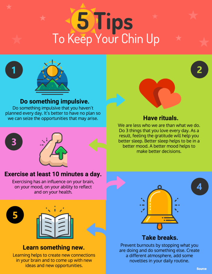
5 Tips to Keep Your Chin Up template. Source: Venngage. One title, five labeled sections, one icon per idea. No data anywhere, and it still works.
What Is an Infographic?
An infographic turns information, data, or ideas into a visual format that is easier to scan and understand at a glance.
The word is short for “information graphic.” University library guides describe one as a page that combines “small amounts of text and visual elements like images, symbols and data visualisations,” usually a single page in length, with text used minimally.
Alberto Cairo, Knight Chair in Visual Journalism at the University of Miami, adds the part most guides skip: “an infographic or a visualization is first of all a tool.”
That word matters. It is why this page sorts samples by the job they do, not by how they look.
Most infographics share the same parts: a title naming the topic and time period, three to five labeled sections, one visual per section, short text, and a source line.
Infographics do not always need data. Only one common type, the statistical infographic, “puts your data front and center,” according to Venngage. The others explain concepts, break down steps, or lay out events in order. Visme’s list adds flowcharts and anatomical diagrams, neither of which carries statistics. If your topic has no numbers, pick a different type.
See Clear Examples of Infographics
Common infographic examples include timelines, statistical charts, process guides, comparison graphics, and student posters.
What is an example of an infographic? A one-page visual poster that uses icons, charts, headings, and short text to explain a topic quickly. The USGS Water Cycle diagram is a real one. It is free, public domain, and published as a poster PDF, a letter-size handout, and a fill-in-the-blank worksheet.
Five quick examples before the gallery:
- A timeline infographic showing historical events in order
- A statistical infographic showing survey results as charts and big numbers
- A process infographic explaining the steps in a workflow
- A comparison infographic putting two products or ideas side by side
- A student infographic summarizing a science, history, or book report topic
Browse 25+ Infographic Samples by Type and Use Case
The best sample depends on your message. Use timelines for events, process graphics for steps, statistical designs for numbers, and poster or PDF formats for school and print.
Every category below follows the same four lines, so you can compare formats instead of scrolling and guessing.
Student Infographic Samples
Sample ideas: Water Cycle, Types of Chemical Reactions, Solar System Facts, Healthy Eating for Students, Civil Rights Timeline, Book Summary.
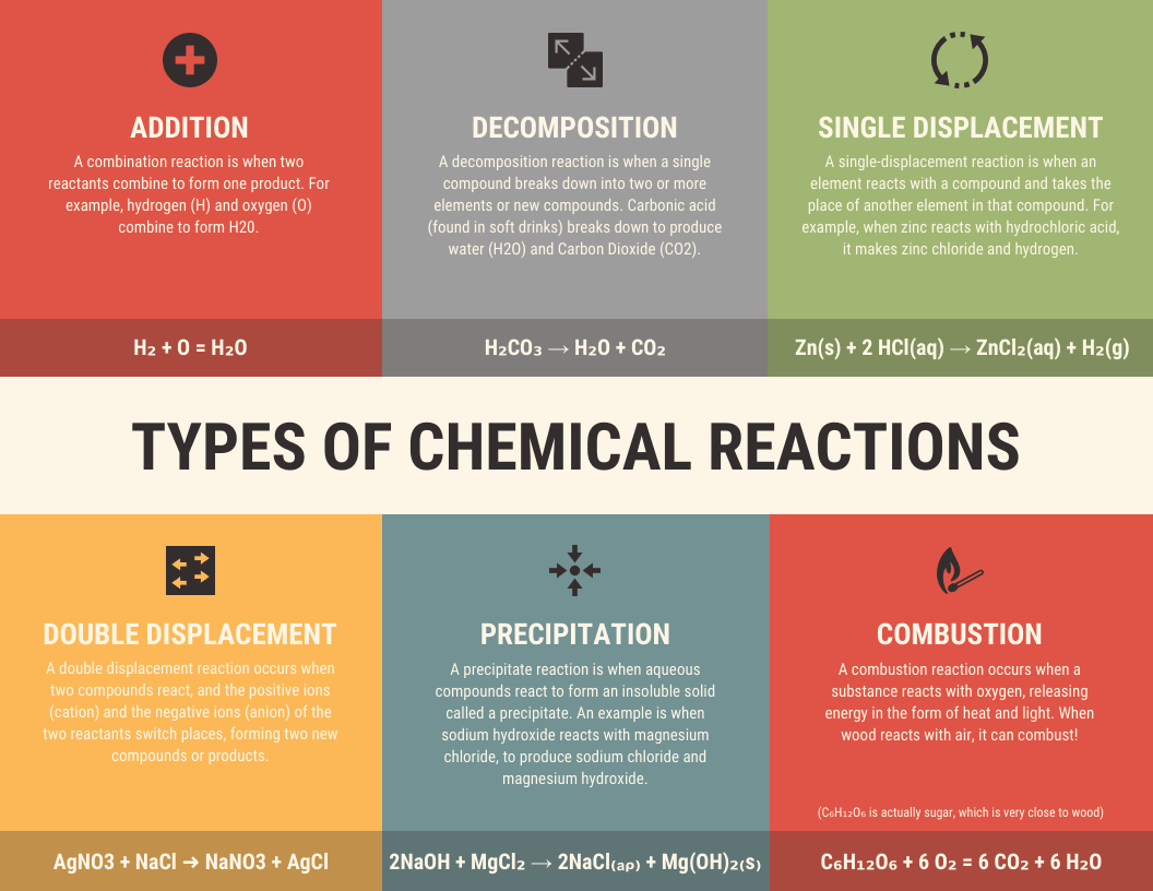
Types of Chemical Reactions template. Source: Venngage. One topic, five bounded sections, no paragraphs. This is the shape a science assignment should take.
- Best for: Class assignments, book reports, science fair summaries.
- Why it works: One page forces you to decide what matters. The limit is the lesson.
- Design tip: Three to five sections, plus a title block and source footer. That count is our recommendation, not a rule. Keep body text at 12 pt or larger; Section508.gov warns against running text below 9 pt.
- Mistake to avoid: Turning in a decorated essay. Past about 40 words, a section is a paragraph in a costume.
For a free, ready-made student sample you can print today, the USGS water cycle diagram ships as a poster PDF, a letter-size handout, and a fill-in-the-blank worksheet. Browse more education infographic templates.
Teachers grade on more than looks. A Penn State assignment lists the criteria as accuracy, clarity, authenticity of content, visual design, and “proper citations of external sources,” and caps each text box at 50 words.
Informational Infographic Samples
Sample ideas: What Is Climate Change, Benefits of Reading, How Sleep Affects Learning, Digital Safety Tips.
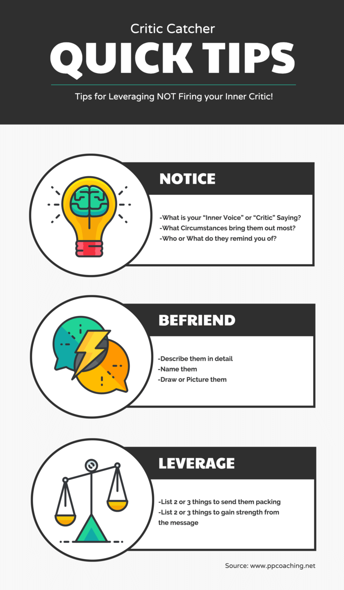
Illustration Critic Tips template. Source: Venngage. Informational graphics carry more text than other types, so bounded blocks do the heavy lifting.
- Best for: Concepts, handouts, awareness campaigns, blog summaries.
- Why it works: Bounded blocks let readers stop after each idea instead of committing to a wall of text.
- Design tip: Give every block the same structure: icon, heading, one sentence. Consistency is what makes a page look designed instead of assembled.
- Mistake to avoid: Decorative icons that do not match the content. An icon meaning nothing costs the reader a beat and buys nothing back.
Browse informational infographic templates.
Statistical Infographic Samples
Sample ideas: Social Media Usage by Age, Global Internet Usage, Student Study Habits Survey, Marketing Campaign Results.
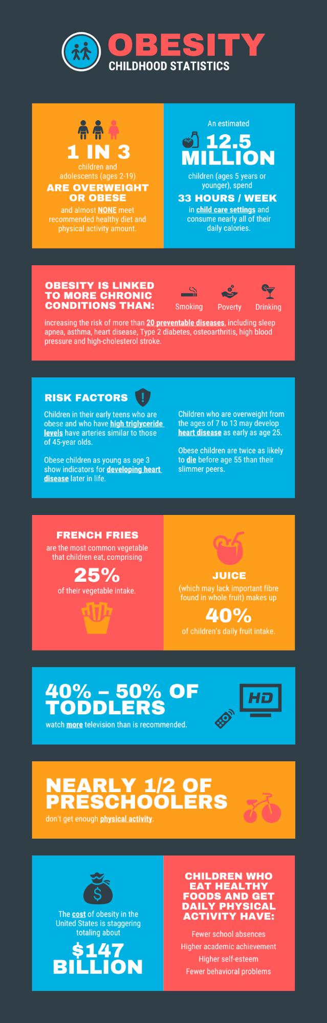
Childhood Obesity Statistics template. Source: Venngage. The biggest number sits at the top, and every figure carries a short line of context.
You do not have to invent numbers. Pew Research Center surveyed 5,022 U.S. adults in 2025 and found 80% of 18 to 29 year olds use Instagram, against 19% of adults 65 and older. The ITU reported in November 2025 that 74% of the world is online, about 6 billion people, while 2.2 billion remain offline. If no real data exists for your topic, label the numbers “sample data” inside the graphic.
- Best for: Survey results, research findings, reports where the number is the story.
- Why it works: One hero number gets attention. The chart underneath earns trust.
- Design tip: Chart parts a reader must see need at least 3:1 contrast against nearby colors under WCAG 1.4.11. That covers bar fills and chart lines.
- Mistake to avoid: Truncated axes and 3-D pie charts. Both exaggerate differences. Kate Moran of Nielsen Norman Group: “You don’t need gaudy stripes or 3D effects to dress it up.”
Browse statistical infographic templates or build the chart itself with a chart maker.
Timeline Infographic Samples
Sample ideas: History of the Internet, Company Growth Timeline, Project Launch Roadmap.
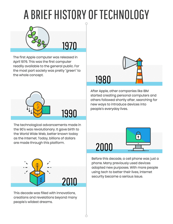
A Brief History of Technology template. Source: Venngage. The dates carry the structure, which is what separates a timeline from a process graphic.
- Best for: History projects, company milestones, biographies, product roadmaps.
- Why it works: The spine gives the eye one path, so reading order is never in doubt.
- Design tip: Decide whether your timeline is proportional, where spacing reflects real elapsed time, or sequential, where spacing is equal. Say which in a small note. Mixing the two is what makes timelines misleading.
- Mistake to avoid: Cramming 20 events onto a page. Eight to twelve milestones is the practical ceiling. Group the rest into eras.
Browse timeline infographic templates.
Process Infographic Samples
Sample ideas: The Recycling Process, How Photosynthesis Works, Customer Onboarding, a Recipe.
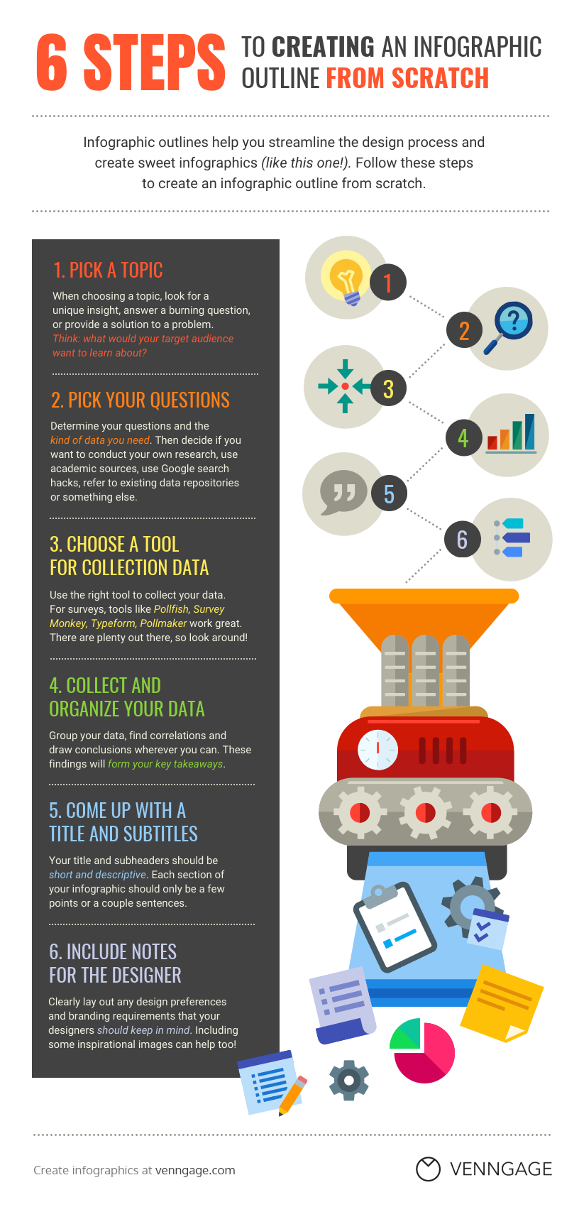
Creating an Infographic in 6 Steps template. Source: Venngage. Each step opens with a verb, because the reader is meant to act on it.
The EPA hands you a ready-made structure: collection and processing, then manufacturing, then buying products made from recycled materials. Those three steps are what the chasing-arrows symbol represents.
- Best for: How-to guides, onboarding, lab procedures, safety instructions, training.
- Why it works: Numbered steps set expectations. Readers know there are five things and budget attention accordingly.
- Design tip: Start every step with a verb. Write “Measure the sample,” not “Measurement of the sample.” Steps stay even and the page stays scannable.
- Mistake to avoid: No ending. Every process graphic needs a visible finish line, not a step 5 that trails off.
Browse process infographic templates.
Comparison Infographic Samples
Sample ideas: Online vs. Classroom Learning, Renewable vs. Nonrenewable Energy, Mac vs. PC.
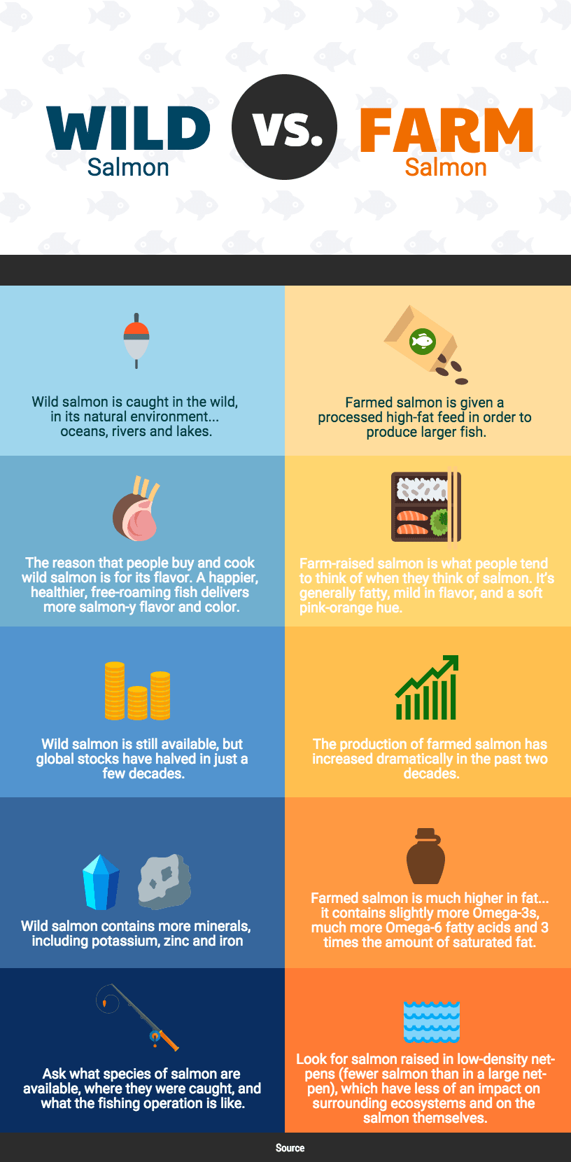
Wild vs. Farm template. Source: Venngage. Both columns answer the same questions in the same order, which is what makes a comparison fair.
- Best for: Product comparisons, two theories, two eras, before-and-after results.
- Why it works: A shared row structure lets readers compare like with like without holding anything in memory.
- Design tip: Use identical criteria in identical order down both columns. If one side has no answer, write “Not available” rather than leaving a gap.
- Mistake to avoid: Telling the sides apart by color alone. WCAG 1.4.1 requires that color is never your only signal. Add labels, icons, or position.
Browse comparison infographic templates.
List Infographic Samples
Sample ideas: 10 Study Tips, 7 Ways to Save Energy, 5 Rules for Better Design.
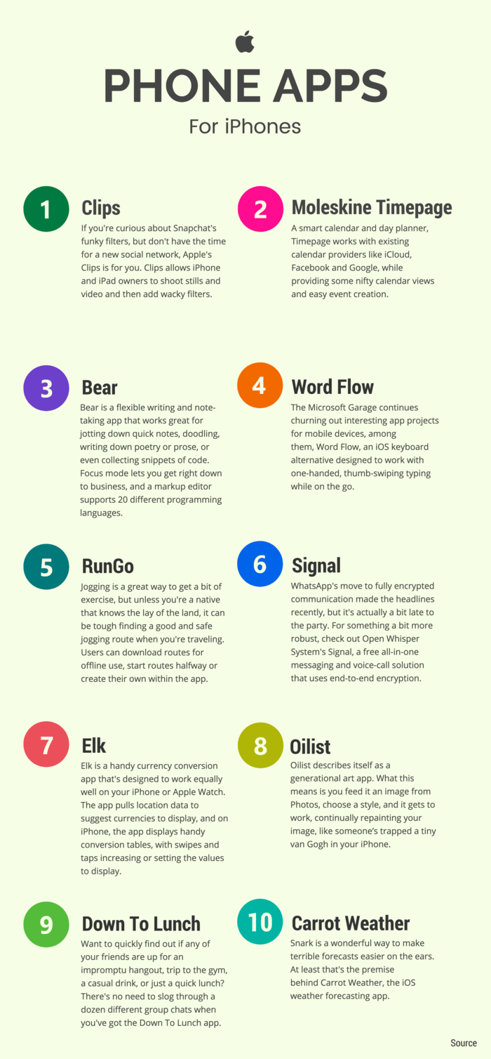
10 Apple Apps template. Source: Venngage. The items sit in no particular order, and nothing is lost by that.
- Best for: Checklists, tips, study guides, social posts.
- Why it works: Items do not depend on each other, so a reader can start anywhere and still get value.
- Design tip: Keep every item close to the same length. Uneven items are the fastest way to make a list graphic look amateur.
- Mistake to avoid: Numbering items that are not ranked. Numbers imply an order you may not mean.
Browse list infographic templates.
Geographic or Map Infographic Samples
Sample ideas: Population by State, World Climate Zones, Sales by Region.
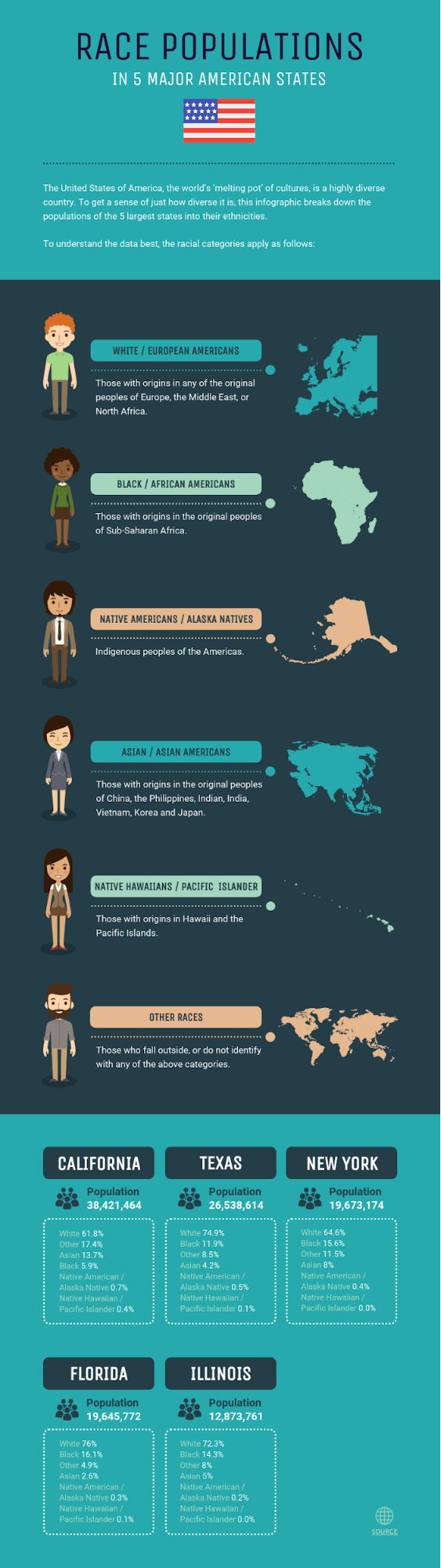
State Race and Ethnicity Population template. Source: Venngage. The shading carries the data, so the map is doing real work rather than decorating.
- Best for: Population data, weather patterns, election results, travel guides, regional sales.
- Why it works: Readers already know the base map, so all their attention goes to the layer you added.
- Design tip: Use one color in light-to-dark steps, and stop at five or six steps. Put the legend inside the image, not just in the caption.
- Mistake to avoid: Mapping raw counts instead of rates. A map of raw totals mostly redraws where people live.
Browse geographic infographic templates.
Flowchart Infographic Samples
Sample ideas: Which Career Path Is Right for You, How to Solve a Tech Issue, Customer Support Decision Tree.
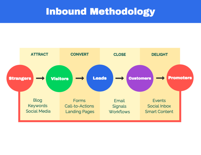
Inbound Marketing Flowchart template. Source: Venngage. The branches are the point. Take out the questions and this becomes a process graphic.
- Best for: Decision trees, troubleshooting, eligibility checks, learning paths.
- Why it works: It answers a question the reader is already asking, so the payoff is immediate.
- Design tip: One shape for questions, one for actions, one for outcomes, defined in a small key. Label every branch “Yes” or “No.” Never leave the arrow to explain itself.
- Mistake to avoid: Dead ends. Trace every path to a final box before you publish.
Browse flowchart templates.
Infographic Resume Samples
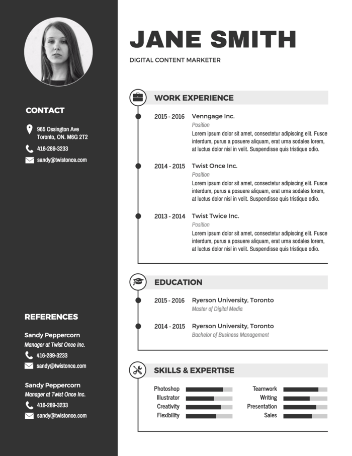
Modern Black and White Resume template. Source: Venngage. Readable first, decorative second. Keep this one for your portfolio and send a plain file to the form.
- Best for: Portfolio sites, LinkedIn, interviews, printed leave-behinds, creative roles.
- Why it works: It demonstrates the design skill it claims, which beats a bullet saying “proficient in design.”
- Design tip: Ship two files. See the caution below.
- Mistake to avoid: Skill percentage bars. A bar labeled “Photoshop 80%” tells a recruiter nothing verifiable, and a parser cannot read it at all.
University career centers agree that applicant tracking systems, the software employers use to scan resumes, cannot read graphics. MIT tells applicants to “avoid use of graphics, icons, or images.” Hannah Morgan, who wrote The Infographic Resume, said the same in 2016: the technology “cannot read visual content.”
So use the infographic version as a portfolio piece, and send a plain single-column resume to the application form. Browse resume templates.
Infographic Brochure Samples
An infographic brochure is not a separate type. It is a brochure that borrows infographic techniques: icons, charts, panels, and short text blocks instead of dense paragraphs.
Sample ideas: Health Clinic Services, School Program Guide, Nonprofit Impact Report.
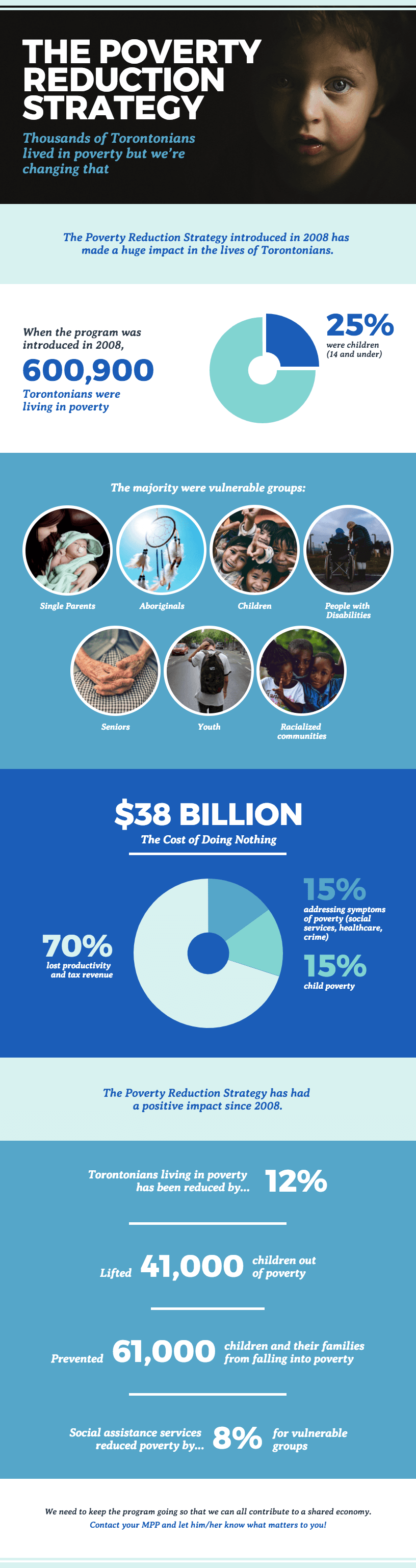
Global Poverty Reduction Strategy template. Source: Venngage. Panelled sections and short text blocks are what separate a brochure from a leaflet of paragraphs.
- Best for: Event handouts, waiting rooms, school programs, small-business service explainers.
- Why it works: The fold does your information architecture for you. Each panel is a natural section break.
- Design tip: Design panel by panel in reading order, and add print bleed. Canva adds 0.125 inches, or 3.175 mm, on all sides for products that get trimmed. Export a print PDF, not a PNG; Adobe notes PNGs “lack CMYK color mode support since they’re designed for web use rather than printing.”
- Mistake to avoid: Putting critical text near the trim edge. Anything within a quarter inch is at risk when the cut drifts.
The CDC’s Clean Hands campaign publishes exactly this kind of asset for clinics and classrooms. Browse brochure templates.
Poster Infographic Samples
Sample ideas: Handwashing Steps, Mental Health Awareness, Classroom Rules, Climate Action.
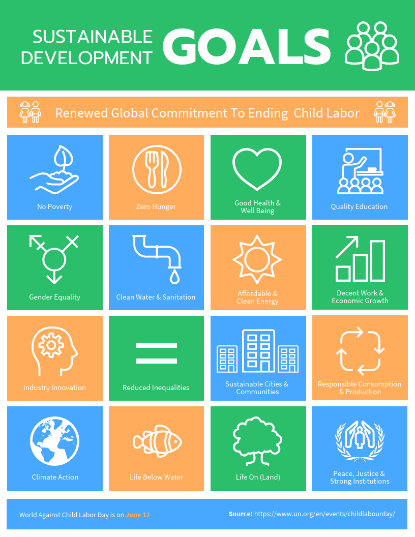
Sustainable Goals Non-profit template. Source: Venngage. A big title, bold icons, very few words. Everything here survives being read from across a room.
Two you can print today: the CDC’s “Five Steps to Washing Your Hands the Right Way” and the National Institute of Mental Health’s free infographics on anxiety, depression, and youth mental health, with Spanish versions.
- Best for: Conferences, classroom walls, campaigns, events.
- Why it works: Extreme size hierarchy lets one page serve two distances. The title reads from 10 feet, the detail from 3.
- Design tip: Use poster typography, not scaled-up document typography. Purdue OWL specifies a 48 x 36 inch poster with titles at 85 pt, sub-headings at 36 pt, body at 24 pt, and captions at 18 pt, readable from 8 to 10 feet.
- Mistake to avoid: Filling every square inch. Breathing room is what makes a poster readable from a distance.
Browse poster templates.
Compare the 7 Common Infographic Types
There is no official list of infographic types. Seven come up most often across design and library guides: informational, statistical, timeline, process, comparison, list, and geographic or map.
Fuller taxonomies go further. Venngage teaches nine, adding hierarchical and resume. Visme teaches thirteen, adding interactive, how-to, flowchart, and anatomical. If you have seen different counts elsewhere, that is why.
| Type | Best for | Example |
|---|---|---|
| Informational | Explaining a topic | “What Is Cybersecurity?” |
| Statistical | Showing data | “Social Media Use by Age” |
| Timeline | Showing events over time | “History of the Internet” |
| Process | Explaining steps | “How Recycling Works” |
| Comparison | Comparing options | “Online vs. In-Person Learning” |
| List | Organizing tips or facts | “10 Study Tips” |
| Geographic or map | Showing location-based data | “Population by State” |
Use the Three Main Infographic Categories
Many guides group infographics into three core categories, because they cover the three most common goals: explain, prove, and teach.
- Informational infographics explain a topic or concept.
- Statistical infographics present data, survey results, or research.
- Process infographics show steps or workflows in order.
Treat this as a simplification rather than a standard. Timeline, comparison, list, and map infographics are full types in their own right in the nine-type and thirteen-type taxonomies. Brochure, poster, and resume infographics are better understood as formats you output them in.
Create an Infographic Sample in 7 Steps
A good infographic starts with a clear topic, the right format, a simple outline, and visual-first design.
1. Choose one clear topic
Pick something narrow enough for one page: the water cycle, how to study better, your company’s sales growth.
“Timeline of World War II” is too broad. “Turning points of the Pacific War, 1942” fits.
A useful test: write down the questions your infographic must answer. More than five means you have two infographics.
2. Pick the right infographic type
| Your raw material | Type to use |
|---|---|
| Numbers and percentages | Statistical |
| Dates and events | Timeline |
| Steps in order | Process |
| Steps with yes/no branches | Flowchart |
| Two things weighed against each other | Comparison |
| Places and regions | Geographic or map |
| Tips with no fixed order | List |
| A concept to explain | Informational |
Common mistake: forcing every topic into a chart-heavy design. Most types carry no statistics at all.
3. Collect your information
Gather your key facts, data points, dates, and sources. For health, climate, education, or statistics, go to a primary source. These are free and citable: CDC, NIMH, USGS, EPA, NOAA, NASA JPL, Pew, and the ITU.
Cairo’s rule is worth taping to your monitor: “A chart shows only what it shows and nothing else.” Put the source and the year next to every number.
4. Create a simple outline
Write the page out as text before you open a design tool.
Here is a real transformation. Start with this paragraph, built from EPA figures for 2018:
In 2018, total generation of municipal solid waste in the United States was 292.4 million tons, or 4.9 pounds per person per day. About 69 million tons were recycled and about 25 million tons were composted, almost 94 million tons in all, a 32.1 percent recycling and composting rate. More than 146 million tons, or 50 percent of the total, were landfilled.
That is 87 words. Now give every number a job:
| Number | Job in the graphic |
|---|---|
| 292.4 million tons | Hero stat, the scale |
| 4.9 lb per person per day | Human-scale translation |
| 32.1% recycled and composted | The tension |
| 69M recycled, 25M composted | The breakdown |
| 146M tons landfilled | The contrast |
Everything else was connective prose. Delete it.
The outline is now: title block, hero stat, human-scale stat, the split, the breakdown, source footer. Six sections, under 60 words of body copy, one column top to bottom. Type size becomes the reading order.
5. Add visuals, charts, icons, and colors
Visuals should clarify the message, not decorate it. Edward Tufte still says it best: “Data graphics should draw the viewer’s attention to the sense and substance of the data, not to something else.”
For chart choice, the Financial Times Visual Vocabulary is the most practical free reference. It sorts about 70 chart types by the relationship you are showing:
| What you are showing | Chart types to consider |
|---|---|
| Change over time | Line, column, area, slope, Priestley timeline |
| Part of a whole | Stacked column, pie, donut, treemap, waterfall |
| Size comparison | Column, bar, paired bar, lollipop |
| Ranking | Ordered bar, dot strip plot, slope |
| Correlation | Scatterplot, bubble, XY heatmap |
| Distribution | Histogram, boxplot, violin plot |
| Spatial | Choropleth, proportional symbol map, cartogram |
One working convention for beginners: three colors plus neutrals, two typefaces. Neither limit is a researched standard, but both keep a first attempt from falling apart.
6. Keep the text short
An infographic should not look like an essay.
There is learning science behind this. The coherence principle, from Logan Fiorella of the University of Georgia and Richard Mayer of UC Santa Barbara, holds that “people learn better when extraneous information is excluded from multimedia lessons.”
Jakob Nielsen’s foundational 1997 usability research found the same on screens: “People rarely read Web pages word by word; instead, they scan the page, picking out individual words and sentences.”
Aim for under 200 words of body copy on a one-page graphic, and under 40 per block.
7. Export as PNG, PDF, or slides
| Format | Compression | Best for |
|---|---|---|
| PNG | Lossless | Web display. Best for text, icons, sharp edges, solid color |
| JPG | Lossy | Photographs. A poor fit for infographics, because compression smudges high-contrast text and lines |
| Vector or hybrid | Printing, school submissions, handouts, posters. Supports CMYK and accessibility tagging |
Adobe and MDN both make the technical point: PNG is lossless and supports transparency, while JPEG’s lossy compression “can produce unsatisfactory results” for diagrams and charts.
For print, export at 300 dpi. That is print-industry practice rather than a formal standard, but it is what commercial printers ask for.
One step almost everyone skips: if you export a PDF, tag it. A tagged PDF carries structure and alt text a screen reader can follow. WebAIM states plainly that an untagged PDF would not be considered accessible. The standard is PDF/UA, published as ISO 14289.
Find Free Infographic Samples for Students
Student samples should be simple, easy to source, printable, and easy to turn into a one-page PDF.
Free, public-domain samples you can download now
| Source | What you get | Topics |
|---|---|---|
| USGS Water Science School | Poster PDF, letter-size handout, worksheet, PNG, 10 languages | Water cycle |
| NASA JPL | 225 infographics, filterable by subject | Solar system, Mars, Earth, exoplanets |
| NASA Space Place | Printable posters, lithographs, bookmarks | Space science for younger students |
| CDC Clean Hands | 8.5 x 11 and 11 x 17 inch PDFs, English and Spanish | Handwashing, hygiene |
| NIMH | Infographics, social graphics, fact sheets | Anxiety, depression, youth mental health |
| EPA | Student infographics and lesson plans | Recycling, waste, environment |
NASA material is generally not under copyright in the United States, but NASA asks that you acknowledge it as the source, and you cannot imply NASA endorses anything.
Build spec for a printable one-page student infographic
| Setting | US Letter | A4 |
|---|---|---|
| Trim size | 8.5 x 11 in | 210 x 297 mm |
| Canvas at 300 dpi | 2550 x 3300 px | about 2480 x 3508 px |
| Safe margin for all text | 0.5 in | 12.7 mm |
| Title | 36 to 48 pt | Same |
| Section headings | 18 to 24 pt | Same |
| Hero number | 60 to 90 pt, one per page | Same |
| Body text | 12 to 14 pt, never below 9 pt | Same |
| Source footer | 8 to 10 pt | Same |
Structure: title block, three to five sections, source footer. Under 200 words of body copy. Export a print PDF to submit, and a PNG if you need it in a slide deck.
Topics with free source material: the water cycle, renewable energy, mental health, climate change, recycling, and space science. Book reports, ancient civilizations, famous inventors, and internet safety have no ready-made free infographic, so treat those as build-your-own.
One warning about “free” templates
Template libraries mix free and paid elements. A university library review of Canva put it well: “you might choose a template based on a graphic that you really like, only to find out that you need a Canva Pro subscription to include that graphic.”
Check for lock or crown markers before you spend an hour designing. Canva for Education is free, but only for certified K-12 teachers at accredited schools, certified school librarians, and students their teacher invites. It excludes uncertified homeschool educators, tutors, and higher education. Check the current eligibility rules before planning around it.
Apply the Good Infographic Checklist
A good infographic is clear, accurate, organized, readable, and understandable at a glance. Run these tests before you publish.
Clarity
- Five-second test. Show it to someone for five seconds, then hide it. Fail if they cannot name the topic.
- One-sentence summary. Fail if you need “and” to join two unrelated claims. That is two infographics.
- Word budget. Fail above about 200 words of body copy, or 40 in any block.
- Title scope. Fail if your title could describe any year or any country.
Hierarchy
- Squint test. Blur your eyes. Fail if you cannot tell which element matters most.
- Three type sizes. Fail if you have fewer than three distinct sizes.
- Reading order. Trace the path with a finger. Fail if it crosses itself or jumps backward.
- Greyscale test. Print it in black and white. Fail if the page stops making sense, because color was doing structural work it should not do alone.
Accessibility
- Body text contrast at least 4.5:1. (WCAG 1.4.3)
- Large text contrast at least 3:1. Large means 18 pt or larger, or 14 pt bold or larger.
- Chart and icon contrast at least 3:1 against nearby colors. (WCAG 1.4.11)
- Never color alone. Add labels, patterns, or position. (WCAG 1.4.1)
- Text alternative exists as real text on the page.
- PDF is tagged if you distribute one.
Those ratios are thresholds, not rounding targets. W3C notes that 2.999:1 does not meet the 3:1 requirement.
Accuracy and sources
- Every number traces to a source. Fail on any orphan number.
- Percentages behave. Fail if parts of a whole do not add to about 100%.
- Axis honesty. Fail if a bar chart’s y-axis does not start at zero without saying so.
- Primary over secondary. Fail if you cited an article that cited the study instead of the study.
- Publisher and year appear in the source footer.
Alt text for an infographic needs two parts
This is where most published infographics fall down. W3C classifies charts, diagrams, and infographics as complex images, meaning they “contain substantial information, more than can be conveyed in a short phrase or sentence.”
Complex images need a two-part text alternative: a short alt that identifies the image and points to the full description, plus a long description carrying the essential information in text.
Not enough: alt="infographic"
Better: alt="Infographic: where America's trash goes, U.S. municipal solid waste 2018. Full text description below the image."
Then put the text version under the image, visible to everyone. It fixes two problems at once, because search engines cannot read words baked into a PNG either.
The scale of the problem is documented. WebAIM’s February 2026 analysis of one million home pages found 16.2% of images had no alt text, and 83.9% of home pages had low-contrast text.
Four stats you should never put on an infographic
Search for infographic advice and you meet the same four numbers everywhere. All four fall apart when you trace them.
| The claim | What it traces to |
|---|---|
| “People remember 80% of what they see” | Michael Molenda concluded the retention percentages appear to have been fabricated by petroleum-industry trainers in the 1960s. Edgar Dale’s original 1946 cone had no percentages on it. |
| “The brain processes visuals 60,000 times faster than text” | A two-page 3M brochure from 1997 that cites no research. Researcher Jonathan Schwabish went looking for the study and found none. |
| “90% of information sent to the brain is visual” | An uncited assertion in a 1996 trade book. |
| “65% of people are visual learners” | No study. A review covering 15,045 educators in 18 countries found 89.1% still believe the underlying myth. |
Real numbers exist, so you do not need fake ones. Richard Mayer found that lessons built from words and pictures together, rather than words alone, produced a median effect size of d = 1.39, which is large. A 2021 meta-analysis of 12 studies on infographics and academic achievement found a pooled effect of g = 1.599, though with only 12 studies, treat it as promising rather than settled.
A pretty infographic can still be wrong
Researchers compared 464 water cycle diagrams from around the world against the actual science. Only 15% showed any human interaction with water, even though human freshwater use now equals about half of global river discharge. Only 2% showed climate change or water pollution. All of them looked fine. They were just incomplete.
The same caution applies to AI. A 2026 paper at the Advanced Visual Interfaces conference analyzed 100 AI-generated infographics and found 99 contained at least one misleading element, including fabricated data and chart types that did not match the data. The authors warn these outputs “risk being adopted uncritically by users who lack the data visualization literacy needed to identify misleading elements.”
Check every number against its source before you publish.
Choose the Right Infographic Sample
Choose the sample that matches your goal, not the design that looks best in the gallery.
| If you need to… | Choose this |
|---|---|
| Explain a topic | Informational |
| Show numbers or survey results | Statistical |
| Present historical events | Timeline |
| Teach steps | Process |
| Guide a decision | Flowchart |
| Compare two ideas | Comparison |
| Share tips | List |
| Show places or regions | Geographic or map |
| Create a school poster | Poster format |
| Summarize services | Brochure format |
| Apply for a creative job | Resume format, plus a plain-text version |
The last three rows are output formats rather than types. A poster is still an informational or statistical infographic underneath, which matters when you pick a layout.
The common mistake: falling for a beautiful sample that does not fit your content. Cairo explains why that backfires: “function constrains the variety of forms that the data can adopt.” The job narrows your options before taste gets a vote.
One sharper test, drawn from the most durable criticism of the format: would a plain paragraph have been faster to read? If yes, it is not an infographic yet.
FAQs About Infographic Samples
What is an example of an infographic?
A one-page visual poster that uses icons, charts, headings, and short text to explain a topic quickly. The USGS Water Cycle diagram is a free, real example you can download as a PDF.
What are the 7 common types of infographics?
Informational, statistical, timeline, process, comparison, list, and geographic or map. No official list exists. Venngage teaches nine types and Visme teaches thirteen.
What are the three main types of infographics?
Informational, statistical, and process. This is a common simplification rather than a standard.
How do I make an infographic example?
Choose one topic, gather your facts and sources, pick the type that matches your material, outline the sections as text, add visuals, cut the text down, then export as a PNG for web or a PDF for print.
What is a good infographic sample for students?
One clear topic, three to five sections, simple visuals, text at 12 pt or larger, a source line, and a printable letter-size or A4 PDF. Science, history, health, environment, and book summary topics all work.
Can an infographic be downloaded as a PDF?
Yes, and it is standard practice. USGS publishes its water cycle infographic as a poster PDF, a handout, and a worksheet. CDC publishes handwashing posters as 8.5 x 11 and 11 x 17 inch PDFs. Tag the PDF so screen readers can follow it.
Why does my infographic look blurry when I print it?
Because it was built at screen resolution. Set your canvas to 300 dpi before you design, which is 2550 x 3300 pixels for a letter-size page, and export a print PDF rather than a PNG.
Where do I put the citations?
In a small footer band inside the image, listing the publisher, the report name, the year, and a short URL. Put it in the image, because the image travels without the page. Repeat it in the text version.
What should every infographic include?
A title with the year and scope, a few labeled sections, visuals at 3:1 contrast, text at 4.5:1 contrast, a source line, and a text alternative if you publish it online.
Do infographics need data?
No. Informational, process, timeline, list, and flowchart infographics explain, sequence, or compare instead. Only the statistical type is built around numbers.
Are infographics still worth making?
Yes, though the criticism you may have read is fair about a narrow target. The backlash was aimed at decorative infographics made to attract links, not at explaining something clearly to a class, a client, or a report reader.
Start With a Simple Infographic Sample
The fastest way to make a strong infographic is to start from a sample that matches your goal, then change the text, visuals, colors, and format to fit your topic.
Match the job to the format. Events over time go on a timeline. Steps go in a process graphic. Numbers go in a statistical design. Concepts go in an informational layout. School work goes on a printable one-page PDF. Services and programs go in a brochure.
Then keep three things true: one focused topic, short text, and a design a reader understands at a glance.
Pick a template that already has the right structure, then swap in your own content: infographic templates by type, or an infographic maker if you would rather start from your own layout.
Before you export, run the greyscale test and the five-second test. If the page still works with the color drained out, and a stranger can name the topic after five seconds, you are done.